This unusual kinetic type bends, morphs, and floats
This unusual kinetic type bends, morphs, and floats
A conversation with Tina Touli, whose animated style brings a quirky joy to typography.
Upon seeing Tina Touli‘s explosively kinetic type just a few weeks ago, I was transported into a world of marshmallow candies, foamy futons and extruded polystyrene pool worms. There is something about puffy 3D objects in motion that bring back the memory of a vivid dream—as a child, I had a vision of being buried by massive fluffy white pillows; at once terrifying and comforting. Touli’s kinetic typography is likewise suffocating and liberating.
Touli is a London-based creative director and graphic designer who also happened to be a PRINT New Visual Artist. She says she “thrives on designing multidisciplinary work that involves a variety of techniques, showcased across different platforms and mediums, always with a great attention to detail.”
Touli practices in digital and print design, typography and animation, and her client list reads like an honor roll: Adobe, Dell, HP, The New Yorker, Ciroc Vodka, Tate, Converse, Glo, Dropbox, LinkedIn—and so on. She’s presented at numerous events, including the OFFF Festival, Adobe MAX, Graphika Manila, FITC Amsterdam, the Toca Me Festival and the Typomania Festival. I believe she’s key to the future of design (wherever in the multi or meta world it is headed).
I knew I had to write about her work immediately, when on the very day that we corresponded, I ordered takeout and the delivery person brought this pizza box featuring her very unusual typography. It was a sign!
Shifting Symphonies
You’ve used typography to explore themes of transition. What inspired your series Shifting Symphonies?
The kinetic typography series dives into the essence of change and transformation. From the balance of “Yin Yang” to the explosive power of the “Big Bang,” the progress of “Come and Go,” the ups and downs in “Up/Down We Go,” and the all-encompassing “Here, There, Everywhere”—each piece emphasizes the pivotal role of transition in our lives. The world today faces major challenges like digital transformation and the pursuit of climate, energy and environmental sustainability. Transition highlights the need to embrace change, strive for balance and accelerate digital transformation for society’s collective benefit. Visualizing this universal process in impactful ways underscores its importance.
What outcome were you seeking for yourself?
This project was about gaining a deeper understanding and expression of transition, pushing creative boundaries, and conveying the importance of change in our lives. The goal was to inspire reflection and encourage viewers to embrace transitions in their own lives with a positive outlook.
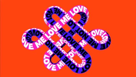
Love Me Not
As a child, you played the “Love me, love me not” game and believed it could come true. Tell us about this project.
“Love Me, Love Me Not” represents the endless cycle of falling in and out of love with ourselves, others and the world. Inspired by the French game of picking flower petals, this artwork creates an infinite loop of possibilities, intertwining fate and luck. The loop’s shape, reminiscent of infinity symbols, forms two reflecting hearts symbolizing endless love. It’s a nostalgic nod to childhood innocence, allowing for a moment of dreaming and wandering.
This is another typographic/kinetic experience made for yourself, not a client. What outcome did you desire?
Although the original draft was for a client who chose a different proposal, the idea felt compelling enough to pursue personally. The goal was to explore the theme of love in a creative way and share a piece that resonates emotionally. The aim was to create a mesmerizing loop that lets people take a break, get lost in it, and reflect on their own love journeys.
Do you believe in luck and chance?
Absolutely! Luck plays an intriguing role alongside hard work and decision-making in shaping our experiences and outcomes. It adds unpredictability and excitement, influencing—but not necessarily defining—the paths we take and the connections we make.
Fuck This Shit
Fuck This Shit seems to be exactly as it sounds. Why?
Fuck This Shit captures those moments of sheer frustration when you want to shout it from the rooftops. This phrase, with its emphatic tone, can either release tension or draw attention, making it a versatile expression of exasperation. It embodies the raw emotion of wanting to let go. (Inspired by Simenone.)
How did you tame the type to convey your message? Or is it all random?
There are countless ways to convey the same words—whether playful, nostalgic, straightforward or whimsical. Different textured typography was created to reflect various interpretations of the same message. The blend of whimsical design with varied backgrounds transforms the message, sometimes offering a lighter tone, other times a more sarcastic one. Ultimately, it’s open to the viewer’s mood and thoughts at the moment to define the exact interpretation of the message.

Did you teach yourself these typographic tricks?
Creating custom typography in the 2D space has been a passion for a while, but the goal was to push those skills further. This piece started as a simple exercise to bring 2D typography skills into the 3D world. It was never intended to be a finished project but rather an exploration and experimentation driven by a love for learning new techniques and challenging oneself.
What do you think the role of kinetic typography is, and what is your role in it?
Kinetic typography brings words to life through motion, adding a dynamic dimension to textual communication. It enhances the emotional and conceptual impact of the message. The role here is to push the boundaries of how typography can convey complex ideas and emotions, engaging viewers in a visually and intellectually stimulating experience.
This story originally appeared on PRINTmag.com. You can read the original here.
ABOUT THE AUTHOR
(3)


