Top 8 Design Trends For 2021
Which design trends should you be concentrating on in 2021?
Well, if you have kept an eye on your business competitors, you might have an understanding of some of these already.
When looking at the graphic design being used on websites and other types of marketing materials, some design trends are clearly standing out.
From those that border on the traditional, with muted color palettes and organic designs, to increasingly innovative choices, such as the use of optical illusion design, there is much to consider if you’re looking to stay ahead of the curve.
Below, we will look at some of the top design trends of 2021, letting you know which you should be keeping up with this year.
#1: Emojis
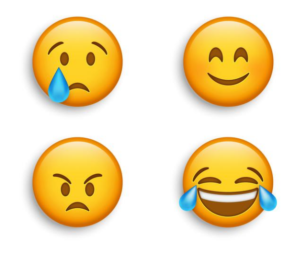
What are Emojis?
There can’t be anybody who hasn’t heard of or seen an Emoji by now.
These innovative pictograms are universally used to communicate messages, be that from social media users to their friends or from web designers looking to add emotional touches to their websites.
What are the benefits of emojis?
Not many people considered emojis’ benefits when they were first introduced, other than the fact that they could communicate visually what the user was trying to say.
But in business, there are all kinds of other benefits, not least the opportunity to connect with millennials who are well used to communicating with smiley faces  and thumbs-up pictures
  on their mobile devices.
It’s possible to create an emotional reaction when you use an emoji, so use them as creatively as you can to form a special connection to your readers.
Emojis are fun too. If we have learned anything this past few months, it’s that people need something to brighten their lives, and Emojis will certainly do that this year.
The pandemic has hit us all hard, and while Emojis won’t change the world, they will give people reason to have more cheer in their lives.
What are the future trends of Emojis in design?
Emojis first came into being in the late nineties when they were incorporated into mobile phones.
At this point, they were used for simple messaging purposes, creating personality within text messages when communicating with friends.
Today, they are all over the internet, and in 2021, we will see designers using ever more creative ways to use them within web and print media.
We will see new Emojis come into being as designers work with businesses to create pictograms that are unique to their products and services.
And we are going to see the development of new Emojis on IOS and Android, giving businesses more ways to communicate with their customers through their social media channels and websites.
#2: Optical Illusion Design
With the right design elements, it is possible to hold a person’s attention for longer. This is especially true when it comes to optical illusion design.
As designers get more creative in 2021, we will see more illusion designs creeping in, capturing the attention of people who will be scratching their heads trying to understand what has been laid out in front of them.
If you use optical illusion design within your brand, you will evoke that wow factor when communicating with your new and existing customers.
Your designs will stand apart from those produced by your competitors, and the creativity you have displayed will do much to improve your brand image.
The longer people take trying to work out the meaning behind your message, the longer they will remember what your image has relayed to them.
So, consider these examples of optical illusions in advertising and work with a designer to develop something for your business.
#3: Organic Design
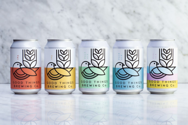
Design studio Horse’s identity and packaging for Good Things Brewing
Designs come and go but there are some that will always return.
This is true of organic design, which has been dipping in and out of fashion for the last ten years or so but is set to make a big comeback in 2021.
The organic design takes its cue from Mother Nature, with colors and shapes that evoke those we see around us in the natural world, adhering to simplicity in design in its truest form.
Soft browns, blues, greens, and faded pinks are commonly found on the color palette of organic design, alongside the undulating lines, dynamic curves, and natural textures that replicate the elements of nature that we see from our windows.
Organic design has always been popular within eco-friendly projects, including those taken on by businesses when communicating their sustainability. But it’s making a comeback now because of our renewed thirst for nature.
As many of us have been locked indoors for months, with little opportunity to explore the natural world, designers have been pushing this design trend to bring a little bit of nature into our homes.
We see it on the web pages we view and the products that we buy, and while the world is a little more accessible to us now, we will continue to see organic design throughout 2021.
#4: 3D Design
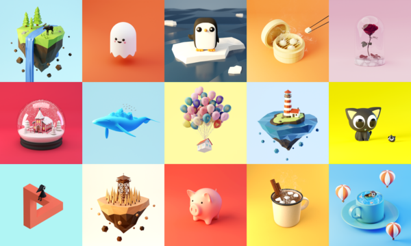
The concept of 3D design isn’t new, but as technology advances, it is getting cooler and cooler.
The rise of Augmented Reality and Virtual Reality has opened up all kinds of ‘can-do’ possibilities for game designers and app developers.
And as web designers become more accustomed to what 3D visuals can do, they add movement and animation to their web pages, giving users a unique visual experience in UX that is far removed from the flat and unremarkable images they are used to.
In 2021, we predict 3D design will become even more impactful. We will see a move into lifelike, hyper-real visuals that are unlike anything we have seen before.
Flat illustrations and photos will be combined with 3D designs to create something that truly pops when viewed on the screen. And we will see more businesses making use of Augmented Reality when creating reality brand experiences for their customers.
What are the benefits of 3D visuals?
When incorporated on a website, 3D designs can interest and engage the viewer, giving them more reason to see what the business offers.
By holding the attention of your site users, you will see a difference in your bounce rate, and you might even win over customers from your competitors too.
Check out examples of 3D visuals on other websites and consider how they can be used to showcase your particular product.
#5: Muted Colors
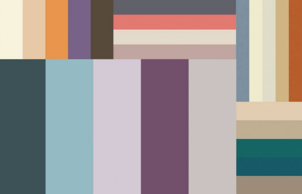
Bold colors can certainly add visual appeal to your marketing, but as 2021 moves on, we see more muted colors in the world of web and packaging design.
These are colors that have low saturation, and for many people, they evoke a sense of peace because of their ease on the eye.
A muted color palette can be achieved by taking vibrant colors and infusing them with white and black, following the minimalist design, or corresponding colors, and a web designer can create these in line with your brand colors.
In recent months, when health and wellness have been at the forefront of people’s minds, we have seen more muted color palettes within web and packaging design.
These calming colors create a sense of harmony and peace, which, let’s face it, are two things we have all been in desperate need of during the pandemic.
This graphic design trend is not dull, despite the lack of ‘pop’ within the design. For many people, muted colors hold an almost hypnotic charm because of the warm and fuzzy feelings they create and because there is something nostalgic about them too.
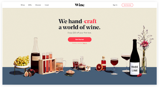
Image Source: winc.com
At the end of last year, the Pantone color of the year was Ultimate Grey and Illumination (an “optimistic” hue of yellow), because of their unique duality.
When explaining the decision to choose these shades, Leatrice Eiseman, executive director of the Pantone Color Institute said:
“The selection of two independent colors highlights how different elements come together to express a message of strength and hopefulness that is both enduring and uplifting…Practical and rock-solid but at the same time warming and optimistic, this is a color combination that gives us resilience and hope…We need to feel encouraged and uplifted, this is essential to the human spirit.”
The smooth, cool look of monochrome design has also been in vogue this year, with web designers using monochromatic filters to experiment with dual tones to evoke feelings of peace and calm.
You can see some examples of monochromatic web designs here. There has also been an increase in designs incorporating muted jewel tones, such as Rose Gold, to add a touch of class to website pages.
This year, we will still see many bold and bright colors as designers strive to catch the eye, but muted colors and even shades of grey will also play their part, to evoke feelings of calm and nostalgia on both websites and print-like materials.
#6: Geometric Design
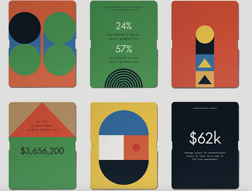
Geometry wasn’t everybody’s favorite subject in school but there’s no denying its uses within the design world.
In 2020, flowing and abstract shapes were prominent within many web designs, but geometric design began to push its way in, and there has been a bigger shift to this style in 2021.
The geometric design is the art of mixing certain shapes, curves, and lines together for an easy-to-remember image. It is often used when creating business logos or producing eye-catching web pages.
It’s a move away from the complicated designs of last year, perhaps because many people are demanding more simplicity after the stresses they have experienced.
Large blocks and solids with strong outlines and colors can be unified into almost limitless combinations, and they are easier on the eye than more abstract design structures.
Look at the creative examples within these websites that have incorporated geometry elements and consider what could be done with your site.
There are endless ways to incorporate them into your design, be that when you’re creating text boxes, images, or a logo to represent your brand identity.
#7: Bold Typography and White Space
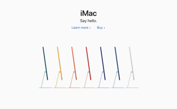
The minimalist look is in, and as can be seen on many websites today, this is being reflected by those websites that focus on bold typography on white space.
The advantages are clear, not least because the combination makes text much easier to read. Without the clutter of images and more complicated designs, site users will concentrate on the messages being marketed and will have nothing to distract them from reading.
The combo of bold typography and white space is also faster to load on websites, so there are advantages for both business users and site users.
And as typographic tools are becoming more and more accessible to casual designers, there is greater scope for this minimalist design style to play more of a part in web design in 2021.
Remote workers have benefited too!
People are likely to work remotely throughout much of 2021, those workers charged with making videos have found it harder to shoot new video content.
As they can’t simply hire a freelancer or work with video teams very easily at the moment (due to safety protocols and location restrictions), they have found that more text-heavy videos have become the way to go.
The combination of bold typography and white space is one creative choice that has become commonplace, as it can be used to create videos that are easy to watch and understand.
#8: Hand-Drawn Icons
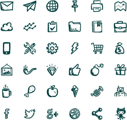
Image Source: jollyicons.com
The final design trend we want to point you to is “hand-drawn” icons. They haven’t been “hand-drawn,” of course, as they can be created on a computer.
But chances are, you have spotted them on social media and around the web in recent months. These illustrations can add a unique, personal, and memorable aspect to design projects, and they can engage site users because of their fun and simplicity.
To showcase your playful side, why not implement hand-drawn icons yourself?
Many other business users are using them to highlight their brand messages in 2021 creatively, so you could too. The world of design is ever-evolving, and the design trends that we have listed here will continue to change and branch out over the months and years to come.
How they will come into play in 2021 and beyond, we have yet to see, but as designers learn how to work within the trends that shape design, we will certainly see some incredible results as a consequence.
Digital & Social Articles on Business 2 Community
(43)

