Top Tips to Increase Website Conversions
Top Tips to Increase Website Conversions

Measuring website conversion is actually a very simple formula. All you need to do is look at the percent of visitors to your website that complete one of your desired actions or goals. Growth-hacking your company takes place as you learn to read your website conversion rates and optimize for the growth. Practice these five practical tactics for improving your website conversion rates.
For example, if your desired action was Complete a Form, then each time a form was completed that would be considered a conversion. The conversion formula is calculated as a percentage. You need to, over a set period of time, take the number of goals or actions completed and divide that number against the total number of visitors.
Website Conversion Rate Formula
Total Visitors: 1000
Total Form Completions: 10
10 / 1000 = 0.1
0.1 x 100 = 1%Total Website Conversions = 1%
Website conversion rate — what does it mean?
- Improving navigation.
- Conversation forms.
- Setting expectations.
- Requesting small commitments.
- Use tools and practical examples and find what works for you.
Why Conversion Rate Optimization (CRO) is important.
The first thing you have to consider is if you already have the traffic coming to your site, why not optimize your site to convert the traffic better? The other option is to spend time and money developing SEO, Social or Paid strategies and campaigns to get new traffic to the site. Remember that you still need to convert your website traffic. Converting website traffic is where CRO can be very beneficial for your company.
We are sharing some of the top tips to improving website conversions for your site that will enhance your business.
1) Active Language on Buttons.
You must make sure you get your calls to action right. It is one of the most important considerations for your website. Typically, calls to action appear on most pages so it is important that they deliver the right messages in the right tone to persuade visitors to act upon them.
Most websites use passive or generic language on call to action buttons. However, using active language will greatly improve engagement rates, which in turn will lead to more sales.
Have a look at these examples:
- Instead of using “READ MORE” try using “VIEW PRODUCT DETAILS.”
- Instead of using “STORE FINDER” try using “WHERE TO BUY.”
- Instead of “PRODUCT CATEGORIES” try using “DISCOVER MORE PRODUCTS.”
- Instead of using “SUBMIT” or “SEND” try using “SEND MY MESSAGE.”
The idea here is to give the user a snippet of what to expect, which increases the chances of the user clicking through.
Black and Decker conducted a very interesting study where they experimented with active language on their primary buttons within their product pages. They experienced a 10% increase in click rates simply by experimenting with the language used on buttons in their product pages.
VIEW THE BLACK AND DECKER CASE STUDY
Google endorsed the approach directly and created an entire topic in its Lead Gen UX Playbook dedicated to the topic created by Black and Decker.
In the guide created by Google, they recommend site owners avoid using generic calls to action and suggest that by making calls to action more descriptive, click-through rates can significantly improve.
According to Google, there are a number of benefits that will result from a descriptive language on buttons and call to actions:
- Links become more accessible to the user
- Links become more persuasive to the user
- Links become more enticing to the user
- Users will feel more confident when navigating through pages
- Keywords in the descriptive text will help improve your search engine optimization.
2) Request Smaller Commitments.
In Google’s Lead Gen Playbook they suggest that rushing a prospective customer to making a commitment comes at a higher risk of losing the perspective.
They give the following advice:
- If you can delay commitment then do it
- Remember that most people are commitment-averse
Consider that your visitor might be interested in your product however they may not be ready to buy just yet. In a consultative situation, asking for a small commitment can be very beneficial; in particular a service company or a product that is more expensive and requires more consideration.
If you consider this alongside using an active language you will be creating a less intimidating proposition and environment for your prospective customers.
For example, if you changed the call to action of your service from BUY NOW to SPEAK TO AN ADVISOR or ARRANGE A FREE CONSULTATION you are reassuring your prospective and demonstrating that there is still a step before commitment.
A really useful case study was completed by Oskar Zabik in which he changed the main CTA to ‘CONTACT SELLER” from “BUY NOW.” In this test, he experienced a 73% increase in conversion rates. View the Oskar Zabik Case Study.
3) Focus on where you currently convert best.

Now, of course, not all conversions are made online. In 2019, one of the Optima clients manufactured wooden toys. We discovered that of all the customers that came to its shop to look at their toys, they had an 80% conversion rate.
We decided to develop their site with a conversion strategy of pushing potential customers to visit the store with a secondary goal of buying online.
The action resulted in a sharp increase in new customers visiting the shop, increasing footfall significantly and a much higher rate of sales.
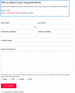
4) Set Expectations in Contact Forms.

The contact form is the primary route of contact for most service-based businesses. For some prospective customers, the act of filling out an inquiry form can be a big commitment which is why it is important to remove as many barriers as possible from the process. You can achieve this by reassuring the prospective about what will happen next; which you can see demonstrated in the example above.
In this example, the forms demonstrate to the prospective exactly what will happen after the form completion:
- The form removes a barrier by explaining what will happen next.
- The form sets out expectations which result in higher quality leads.
- The form gives higher opportunity for clearly defined messages in the contact form itself.
- It is also good practice to offer the prospective an alternative method of contact.
- Generally, with the form, you’ll have a direct contact number is offered too.
- The form appears more friendly and less intimidating.
- The key to driving more conversions is being friendly, and less intimidating.
The tone should be conversational and natural which generally leads to higher conversion.
5) Expose Key Navigation.
Similarly to active language on buttons, it is important to ensure website visitors understand clickable options quickly and easily. You need to avoid forcing confusion and guesswork for your visitors.
Let’s say your website sells a product online; by displaying as many of the main product categories in your main website navigation as opposed to just putting “SHOP” with a drop-down, you will significantly improve navigation and conversion opportunities.
It is good practice to expose primary actions all the time, even on mobile where real estate is at a premium.
Conclusion
The Optima company is all about Digital Innovation, Digital Governance, and Digital Strategy. We work to help our partners achieve brand success in competitive markets across Australia, New Zealand, and Asia.
Optima is one of Australia’s go-to Digital Agencies and a leading Digital Agency Sunshine Coast providing a level of digital creativity and digital leadership that companies require when competing in saturated markets and competitive industries.
The post Top Tips to Increase Website Conversions appeared first on ReadWrite.
(11)

