According to astronaut Mark Kelly and plenty of other experts, Donald Trump’s Space Force is, simply put, a pretty dumb idea. Nonetheless, last night the president’s reelection campaign released a slew of possible Space Force logos–and they’re right in line with the stupefyingly bad design Trump’s team is known for (see: Exhibit A and Exhibit B).
Trump and Vice President Mike Pence announced the Space Force concept last June, proposing a new branch of the military that will be aimed at space. “We are going to have the Air Force and we are going to have the Space Force, separate but equal,” Trump said at the time. The idea was met with widespread derision from Kelly and others, for several reasons. The United States already has a Space Command. It’s been around since 1982. Space defense is also one of the U.S. Air Force’s core missions, which currently involves monitoring space from natural and third-country threats, protecting military satellites, and foiling Mulder and Scully’s efforts to unveil an alien conspiracy to take over Earth.
Jokes aside, there’s not a lot to do since the United States, the Soviet Union, and the U.K. signed the Outer Space Treaty, prohibiting any militarization of space, in 1967. Other countries with space programs, including China, are also treaty signees. There’s simply no war in space, period. So there’s really no need for a sixth branch of the U.S. military. And NASA–which works with the Air Force–already takes care of peaceful exploration.
Despite the absence of a real need or purpose for the Space Force, the Trump team is forging ahead. This week, Vice President Pence gave a speech at the Pentagon, declaring that “the time has come to write the next great chapter in the history of our armed forces.” The same day, the Trump-Pence 2020 campaign PAC emailed supporters with a collection of possible logos for the force, asking people to vote on the ideas. According to ABC’s Justin Fishel, on Twitter, the email came from Brad Parscale, the current director of the 2020 campaign, who has a background in branding as one half of the San Antonio, Texas–based agency Giles-Parscale.
Before we get to the logos, let’s take a moment to breathe, because these logos aren’t official in any way. They weren’t created by anyone at the Pentagon, NASA, or any other federal agency. They were created by the Trump-Pence 2020 campaign PAC. And, as Parscale notes, they’re going to be used to “commemorate” the Space Force with a new “line of gear.”
In other words, this is for merch. Still, let’s take a look.
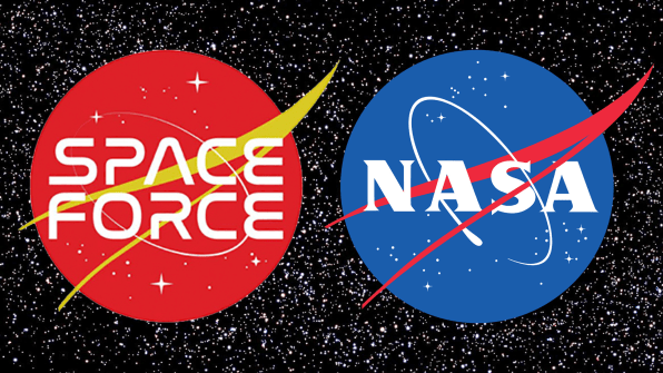
The first logo is a blatant copy of the current NASA logo, aka the “meatball,” which was designed by NASA employee James Modarelli, in 1959. The Trump knockoff replaces the classic mid-century typeface with an anachronistic 1980s font, which itself bastardizes the beautiful NASA Worm logo, from 1975. Meanwhile, the swoop is now an inexplicable shade of mustard, and space itself is now a red state. I guess it’ll match the MAGA hats?
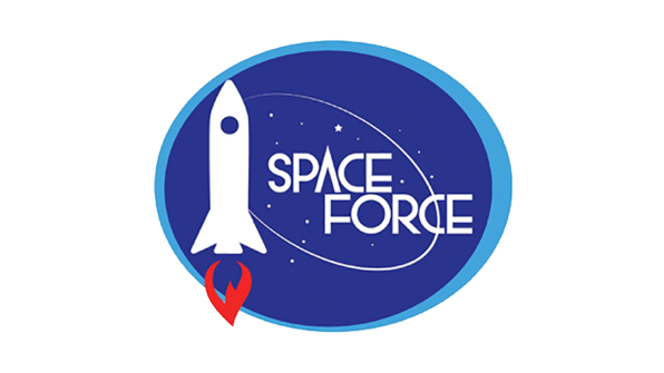
The second logo returns to dark blue, eliminating the delta wing but retaining the white orbital line and some of the “stars” of the NASA logo. It features a strangely stylized 1940s novella version of a rocket, its powerful engine fumes symbolized by . . . an inverted “flammable” icon. An oddly kerned, Art Deco-tinged typeface completes this atrocity.
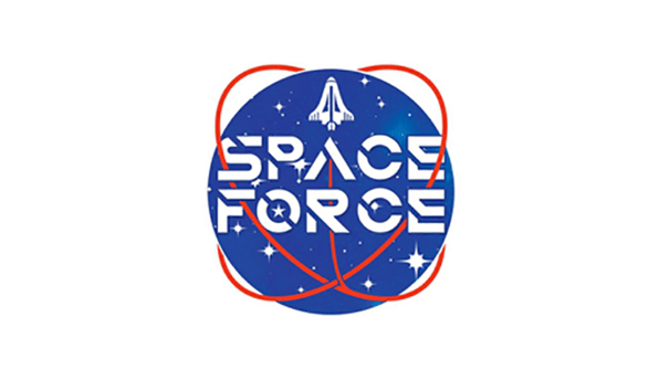
Here we have what looks like a poor misrepresentation of the retired space shuttle trying to escape the deadly embrace of a red space snake (or perhaps it’s the galactic spaghetti monster?). Your guess is as good as mine on this one.
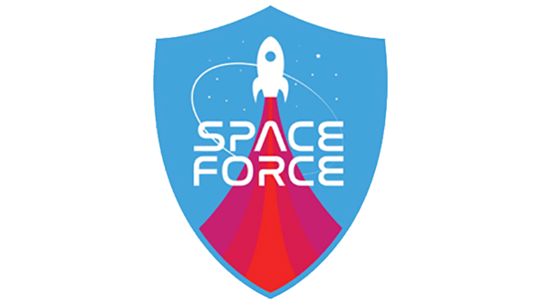
Didn’t I see this on Buzz Lightyear’s box? We’re back to a stylized version of a rocket here, but this time it’s Tintin: Destination Moon–style. Nothing says Space Force like a children’s toy.
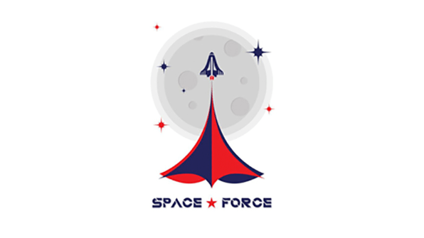
This option is perhaps the most confusing. Does the clip-art moon imply that Space Force’s jurisdiction is restricted to lunar orbit? What is the insignia coming out of the rocket’s engines meant to represent? Why? Who? Wha—
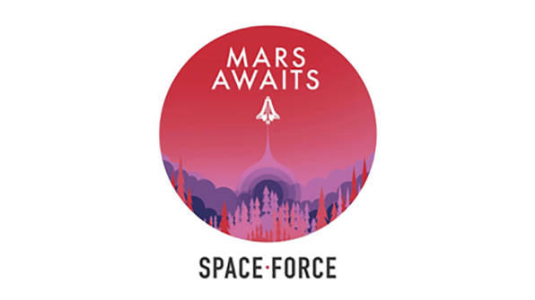
This one doesn’t even try to pretend to represent Space Force’s supposed mission. It’s emblazoned with a random slogan, “Mars Awaits Space Force,” which seems to imply a mandate to reach Mars independent of NASA’s own missions. Is the idea to colonize the Red Planet before anyone else can? Does the Trump team know that there are no pine trees on Mars?
Perhaps the most absurd aspect of this project is the fact that the Trump-Pence 2020 campaign is asking people to choose a logo for a military branch that doesn’t exist, and probably never will. Even if Space Force–and the further needless spending on the military-aerospace-industrial complex it would enable–is realized, its identity will be developed according to the Pentagon’s standard government-contracting processes.
But I digress. Ultimately, this is just a poor attempt to distract Trump supporters from the president’s legal troubles–and a way to sell more campaign merch.
(56)