Trump’s terrible new design for Air Force One is unpatriotic
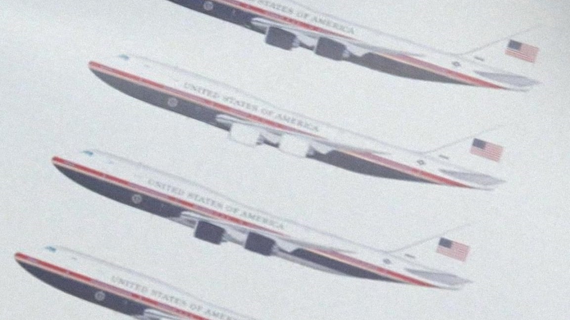
Donald Trump has unveiled a new design for Air Force One in a segment filmed with ABC News. He first teased the concept last July, insisting that it would be rendered in red, white, and blue, and look “more American” than the design in use today. Indeed, the images Trump shared with ABC News show a flat red, white, and blue paint job, with the American flag on the tail. Part of a $3.9 billion plan to revamp the presidential plane, the new look may arrive in 2024, pending approval from the House Armed Services Committee. One reporter described Trump’s vision as “patriotic.” Except one problem. It’s exactly the opposite.
“Here’s your new Air Force One.”
Pres. Trump shows @GStephanopoulos mock-ups of his vision for the next generation of the presidential aircraft during an exclusive @ABC News interview. https://t.co/9SiLyaVVjy pic.twitter.com/bdlDZMns8Q
— ABC News (@ABC) June 13, 2019
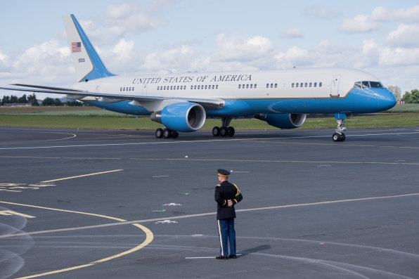
The Air Force One design we have today is not only more beautiful than Trump’s version; it’s a better representation of American design, and perhaps even America itself.
Air Force One’s livery (a fancy term for the exterior decals of a plane) was the vision of industrial designer Raymond Loewy. A war veteran and an immigrant, he contributed to many of the celebrated designs that remain part of this nation’s collective history. He was born in France and served for the country during World War I, immigrating to the United States in 1919. Originally working as a fashion illustrator for Harper’s and Vogue, he made his way into industrial design and designed all sorts of things, from logos to office furniture. But transportation was an ongoing passion. He designed trains, cars, and buses for brands like Studebaker and Greyhound, always with an eye toward how graphic design and industrial design mixed.
You can see this with the GG1 electric locomotive. He didn’t design this entire train. But he gave the hulking, 475,000-pound locomotive a sense of agility and grace, replacing its rivets with smooth welds and giving it a flowing speed line on its side to draw out the engine’s contours. Another example is the GX-7 prototype bus he helped develop for Greyhound. What could have been a big steel rectangle is instead a bit Googie, a bit mod, a bit maritime, and a bit anthropomorphic. (Tell me you don’t want to Instagram your next cross-country trip standing outside that thing.) Loewy was exceptional at making big, boring machines look fast and fascinating.
In 1962, the Kennedy White House tapped Loewy to design the livery for Air Force One. Keep in mind that by this time, Loewy had designed for Coca-Cola, IBM, and Boeing–a shortlist of celebrated American brands. As the New York Times tells the story in a superb 2015 profile, JFK inherited a plane from Dwight D. Eisenhower that was painted orange for visibility. Loewy spotted it landing one night and told his friend, who happened to be President Kennedy’s Air Force aid, that it was “rather gaudy.” At the time, a new Air Force One was under construction. So Loewy offered his design consultation services without charging a fee.

[Photo: Loic Venance/AFP/Getty Images]
Loewy showed Kennedy some ideas months later at the White House. Kennedy liked a red and gold version of the plane, but asked that the red be swapped out with blue, his favorite color. The blue was technically a mix of two blues, sky blue and ultramarine blue, printed on the side of the plane and the tail like a racing stripe. Kennedy also selected the Caslon typeface for the plane, which was used to render “United States of America” on an early printed version of the Constitution. Altogether, the design painted an optimistic portrait of the United States: rooted in the past, but flying inexorably into the future.
The design has remained unchanged since, and today it’s an icon. Early drawings of the design have been admitted to the Museum of Modern Art’s permanent collection. The plane is literally printed with the words of our founding fathers.
Trump’s plane ignorantly does away with all of that historical and practical significance. Loewy’s arching blue lines–those clever flourishes that Loewy used to give half-a-million-pound trains a sense of speed–are gone. The replacement is some stacked, red, white and blue design that’s rendered like a 747 sandwich. It looks like the livery of Trump’s personal plane, flipped upside down.
How’s that for a metaphor of America?
(23)


