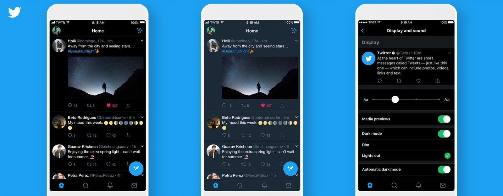
Twitter is now one month in to the beta testing phase of its prototype app twttr, and the company is rolling out another batch of experimental changes. The new features include an updated design meant to make conversations easier to read, the ability to like a tweet by swiping right-to-left in conversation view and new labels for the original author and people you follow. It’s also bringing a few Twitter app features to twttr, including the updated Twitter camera, dark mode and profile previews.
Big @twttr update! Dark mode and a ‘swipe to like’ gesture. pic.twitter.com/7e2Sq2riW5
— John Yarbrough (@jyarbrough) April 11, 2019
This is all part of the company’s ongoing mission to make Twitter conversations easier to understand. In a tweet, Sara Haider, a director of product management at Twitter, said the beta users prefer the twttr app over the original and find conversations easier to follow. “We’re excited about this — it shows us that we’re on the right path but still have more work to do before launching to everyone,” she wrote.
Twitter has also been making changes to the Twitter app, like the new conversation labels it recently debuted. Last month, a software engineer discovered a prototype for a “subscribe to conversation” button in the Android version of the app, and the iOS app finally got dark mode. So, while twttr might be the company’s experimental platform, even regular Twitter users are seeing changes.
Our prototype app, twttr, has been live for 30 days. We’ve learned some things! We are constantly making improvements based on your feedback (see below), so keep reading this thread to see the new features we’re adding today. #LetsHaveAConvo https://t.co/0isBWWnEJ6
— Twitter Support (@TwitterSupport) April 10, 2019
(11)

