Twitter’s search results are now sorted by relevance
Earlier this year, Twitter started moving away from the reverse chronological timeline and started prioritizing algorithmically “relevant” tweets in order to keep users more engaged. Starting today, Twitter will now be ordering its search results the same way in hopes that more relevant results will improve the search experience as well.
Lisa Huang, a senior software engineer on Twitter’s Search Quality team, explained the reason for the change in a blog post by pointing out that Twitter moves fast and the most recent results may not be the exact tweet you were looking for. (When you’re looking up a tweet with an original joke, for example, but search only turns up the endless quotes and retweets.)
In order to decide which tweets to show, Huang’s team has been testing a variety of factors to perfect the results layout as well as the machine learning model that actually ranks the results. But it is ultimately what you (and everyone else on Twitter) click on that gives Twitter its definition of what is relevant.
“A person’s behavior on Twitter provides an invaluable source of relevance information,” Huang wrote. And Twitter has data showing everything from which tweets you’ve seen to which tweets you’ve interacted with and how you interacted with them. “Using this information,” Huang continued, “we can train machine learning models that predict how likely a Tweet is to be engaged with.” Those machine learning models then rank “relevant” tweets based on the probability that users will engage with it.
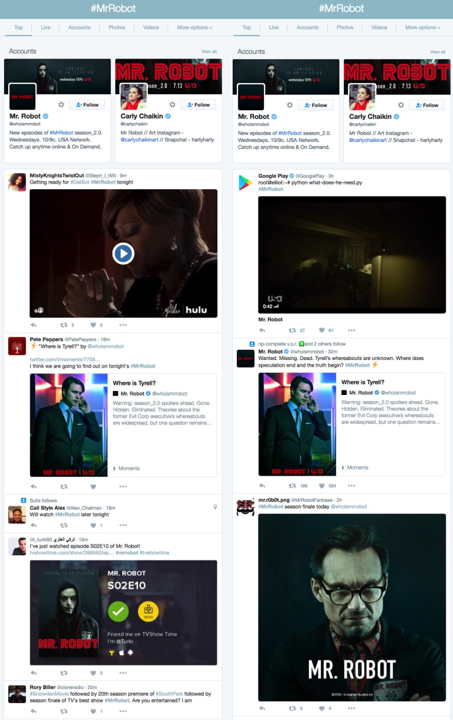
While it make sense that everyone wants to see the most appropriate information to their search, the fact that a tweet is likely to get a lot of retweets doesn’t necessarily make it relevant either. To show the new results page in practice, Twitter offered a side-by-side of comparison of the old layout (below left) versus the new (right) for a search of #MrRobot. While the new page is less cluttered, at least in this example it also seems to favor the brands and official accounts while pushing individual users further down the page.

(24)


