U.S. election maps are wildly misleading, so this designer fixed them
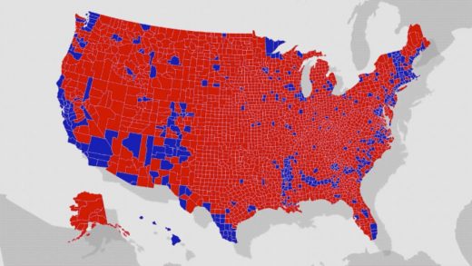
It started with a tweet from Lara Trump. On September 28, 2019, the House of Representatives was preparing for impeachment hearings against Donald Trump. And she posted the electoral map from 2016—a familiar sea of red that implies America itself is Republican. Over the top of it, the caption read, “Try to impeach this.”
The Belgian designer Karim Douïeb—who runs his own data visualization company, called Jetpack—came across the post. It bugged him because, like so many electoral maps, it framed thousands of miles of empty land as voting for Trump instead of representing the few people actually living in it.
Challenge accepted! Here is a transition between surface area of US counties and their associated population. This arguably provides a much more accurate reading of the situation. @observablehq notebook: https://t.co/wdfMeV5hO4 #HowChartsLie #DataViz #d3js https://t.co/lStHeeuMUw pic.twitter.com/MpYiXtsHmu
— Karim Douïeb (@karim_douieb) October 8, 2019
“I told myself, this is completely wrong in terms of data visualization,” Douïeb recalls. “I’m not so into politics or anything, but I had to correct this visual mistake.”
So after work one night, after putting the kids to bed, he spent two hours on a retort.
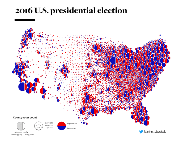
“Challenge accepted,” he wrote on October 8, 2019, as he posted the perfect correction: A GIF that started as Laura Trump’s 2016 electoral map but then transitioned to a more accurate representation, which depicted the actual count of red and blue votes in counties across the nation as simple circles, their size proportional to the number of votes. And finally, Americans had a portrait of our country’s voting habits that was accurate: Not the normal sea of red, but a polka-dotted country, where blue voters are ever so much more prominent than red ones.
“The next day it went insane,” says Douïeb. “My phone was buzzing with notifications. [I gained] 7,000 followers overnight. It was mental, to be honest. I wasn’t expecting this.”
Nor was Douïeb expecting what has followed. A year since Douïeb posted his correction, versions of his map have gone viral again and again—especially in the last week alone, when they’ve garnered hundreds of thousands of likes across Twitter accounts. It has become the go-to portrait of a divided America, and an instant retort for liberals to explain why this election isn’t being stolen for Biden—because, see? Our country isn’t predominantly Republican after all.
The standard electoral maps are a scourge to many in the data viz community. Just go to The New York Times or FiveThirtyEight, and you can see their workarounds to twist and squeeze the United States into something that captures both the scale and the geography of voting.
“Other attempts have been [made to] represent every single vote into a point,” Douïeb concedes. “But the key here was to start from the original map and make the transition. It’s like a counterargument, where you start with the argument of the opponent and attack it straight away. But then you keep the context of what it was initially.”
Indeed. The visual also works because it needs no explanation. There are no legends on the side or gimmicks to deconstruct. The transition from one way of thought to another is so striking that it’s almost uncanny. It requires you to reboot your brain and conceptualize voting differently.
After releasing his two-hour map last October, Douïeb spent two months refining it, using more accurate data than Lara Trump had started with, and extending the animation to a full 20 seconds. This longer version is objectively better. It overcomes the uncanniness of the original.
“The impact of it was insignificant. It [got] 100 likes, maybe. Nobody noticed it,” says Douïeb. “So it’s kind of weird, people are not willing to spend . . . 20 seconds watching a clip.”
But while Douïeb was working on his longer model, a Redditor named ResplendentShade shared a new spin on Douïeb’s original GIF. It adds the text “Land doesn’t vote. People do.” It also credits Douïeb as the original creator. (ResplendentShade, a carpenter by trade who prefers to remain anonymous, says he didn’t create the remix but remembers grabbing it off someone’s Twitter account.)
Data visualization insights:
Land doesn’t vote. People do.#USElection2020 pic.twitter.com/MJWKPftOsx— Bettina Forget (@BettinaForget) November 5, 2020
As Douïeb points out, the GIF is poorly constructed. It’s quite compressed and difficult to read. But it went viral on Reddit (20K likes), and its extra message, overtly spelling out what the visual had said tacitly, has made it the go-to share on Twitter during this election week.
It is this annotated version that has answered the moment.
As for Douïeb, the challenge of depicting red and blue votes still irks him. He created a whole website that walks through different, alternate visualizations of 2016 election data. One map in particular is inspired. Instead of depicting counties as red or blue circles—with a winner-take-all mentality—he split all of the circles into red and blue parts. As a result, you can see that a city such as New York or Chicago isn’t 100% blue but has a conservative base too. It’s both more fair, and more accurate, than his original retort.

Even still, Douïeb is grateful to see that his original visualization lives on and is depicting an idea that words can be so challenged to articulate.
“The GIF was making the point, it’s not just about a system—it’s about people. That’s what’s most important,” says Douïeb. “It’s an insult if you just say, ‘This is our country, and it’s all red.’ It doesn’t represent anything. That was the point.”
(57)


