‘USA Today’ Redesigns Site, Introduces New Options For Advertisers

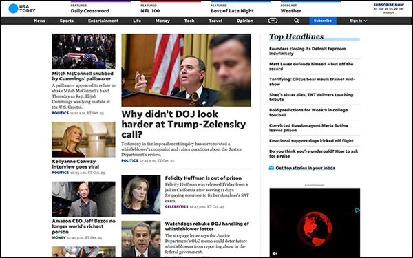
USA Today unveiled a site redesign (November 01, 2019), with new features, a simplified look and increased page speed, with the goal of creating one uniform brand experience across platforms, while encouraging user engagement.
USA Today’s last major redesign was in 2012, for its 30th anniversary.
“We felt we’re due, especially as we head into major editorial events across sports and politics, including the Olympics and 2020 election,” Jason Jedlinski, head of consumer product, told Publishers Daily.
USA Today.com has an audience of more than 80 million digital users, according to the company.
Other recent changes to improve user engagement across USA Today’s digital offerings is a switch from a horizontal to vertical photo gallery template.
USA Today’s product design team studied a year’s worth of engagement and search trends to optimize how content is arranged and displayed on the website and across digital platforms.
“We are continually upgrading and adding features to our digital products as part of our ongoing digital evolution as a media company… We aim for consistency, so our audience can enjoy familiar experiences however they enjoy our storytelling,” Jedlinski added.
Kris Barton, Chief Product Officer of Gannett | USA Today Network, stated a second goal was “providing more brand-safe environments with unique creative opportunities for advertisers.”
Advertisers can produce branded environments for sponsored content.
Advertisers can “create unique environments with custom colors and templates — resulting in more ‘ownable’ pages,” Jedlinski added. “We’ve also incorporated tools from our articles into clients’ pages, including a list of ‘More Like This’ links.”
Other updates to the site include new “flags” to highlight trending content. Franchises such as “Humankind” and “Sports Pulse” have a new display, and USA Today improved its site search function.
Each subsection is now associated with bold colors to make it easier to spot topics like sports, entertainment and tech.
The new color strategy is an effort to “remind everyone that USA Today is more than just the news,” Jedlinski noted.
USA Today also wanted to more clearly differentiate to readers opinion and editorial content – a new yellow label, called a “virtual highlighter,” will distinguish the two across platforms. (That will also include newsletters soon.)
“Now, more than ever, it’s critical that we defend and protect our audience’s trust. We think this is a fresh, innovative way to show our commitment to transparency,” Jedlinski said.
(52)