Verizon is the new Netflix, Kate Spade releases a ketchup-themed bag, and Toys ‘R’ Us gives us nightmares
Verizon is the new Netflix, Kate Spade releases a ketchup-themed bag, and Toys ‘R’ Us gives us nightmares
These are the branding stories we’re following this week.
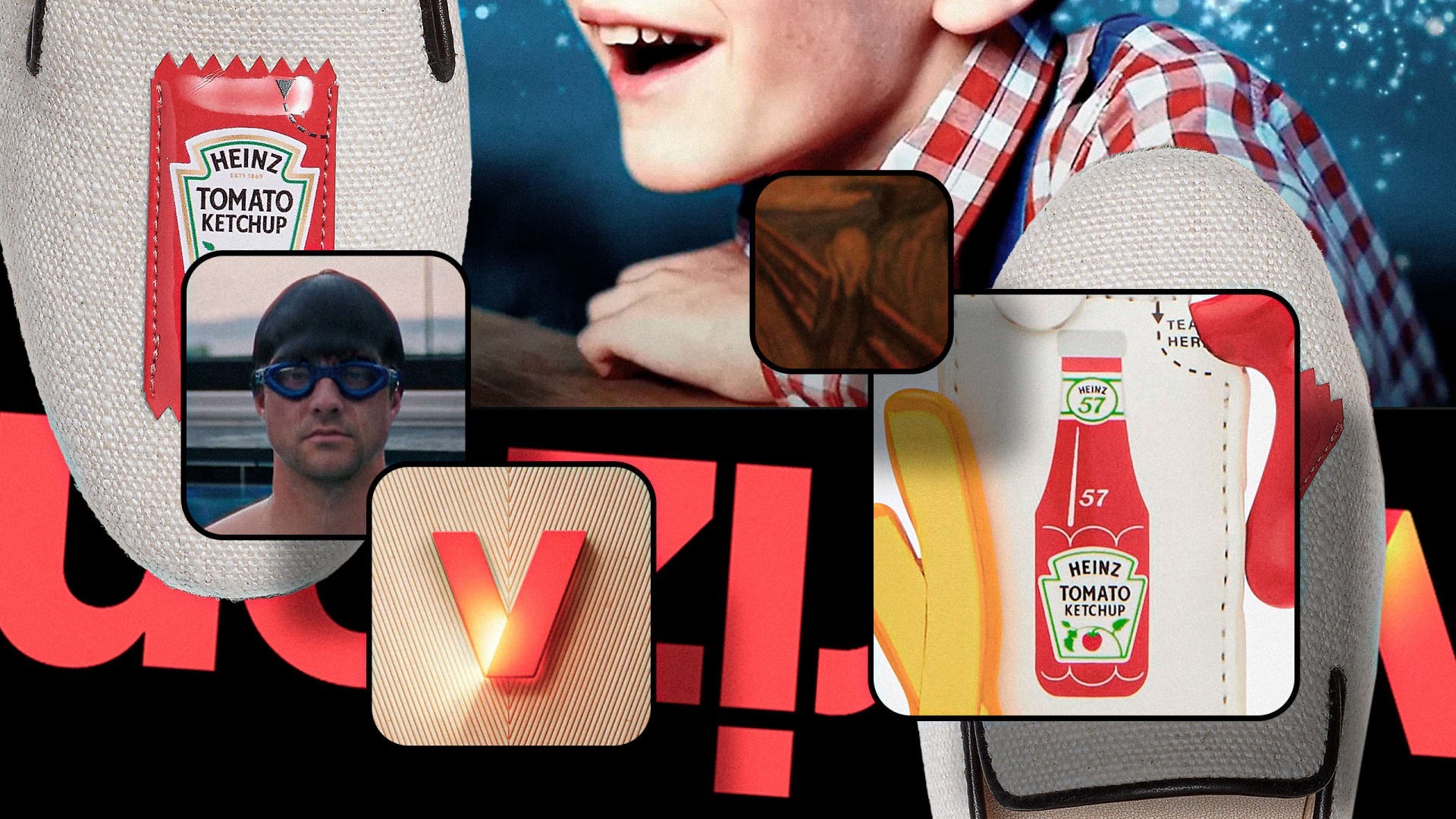
This week in the world of branding, Verizon ditched its 20-year-old brand symbol, Kate Spade kicked off #tomatogirlsummer, and Toys “R” Us ruined our childhoods with a creepy GenAI commercial. Here’s a recap of the branding stories we can’t stop talking about:

The news: After a controversial rebrand back in 2016, Verizon just unveiled a new logo that scraps its 20-year-old check mark symbol . . . and it looks a little, well, familiar. The red wordmark features a glowing ribbon V that’s strikingly similar to Netflix’s signature N.
Big picture: When any recognizable company decides to ditch a core element of its logo, it probably marks a shift in the brand’s positioning—and Verizon is no exception. According to Ricardo Aspiazu, VP of creative and brand, Verizon wants to become an “experience-of-life company,” in part by incorporating more lifestyle imagery into its promotions. That might also help explain why the new logo looks more like something from the media world than a wireless provider.
Why it matters: Reactions on social media have been mainly stuck debating the new logo’s existing look-alike, but Verizon’s refresh can actually teach designers about the power (or lack thereof) in brand symbols. It might seem like common sense that a company should prioritize the recognizability of a decades-old symbol, but sometimes those designs just don’t stick as much as they should. In testing phases, Verizon’s existing Neue Haas Grotesk font proved much more recognizable than the check logo, which consumers could identify only 30% of the time. In this case, “Out with the old, in with the new” is the name of the game.

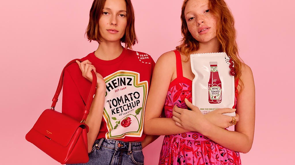
The news: Want your luxury loafers with a side of ketchup? Look no further than the new Kate Spade x Heinz collection, which also includes a crossbody purse resembling a ketchup packet, a cheeky T-shirt sporting the Heinz logo, and an electric-red leather bag.
Big picture: Last year TikTok users declared it #tomatogirlsummer, which describes a Mediterranean-inspired, rosy-cheeked appeal that can span everything from makeup to clothes and (shocker) recipes. Brands are keeping the trend alive this summer in all kinds of unique ways. Lisa Says Gah’s collection with Hunts, Staud’s tomato bag, and Vrg.grl’s tomato-print skirts walked so that Kate Spade could run.
Why it matters: There’s no doubt about it—foodie aesthetics are in, and they don’t seem to be going out of season (get it?) anytime soon. The obsession with food apparel ties in with a burgeoning hellscape of cringey collabs, from ranch-flavored Burt’s Bees to neon-pink Barbie ketchup. For many big-name food brands, just being on your shelves isn’t cutting it anymore—they want a spot on your Crocs, your handbag, and your coquette summer dress, too.

The news: If you’re in the mood for some nightmare fuel, it’s available in droves in Toys “R” Us’s new GenAI-powered commercial. The spot tells the history of the brand’s founder, Charles Lazarus, and his mascot companion Geoffrey the Giraffe. Oddly, it seems specially crafted to kill the magic and joy that we once found in the world of toys.
Big picture: By the brand’s own admission, the new video was born of a desire to be the “first brand film ever created using OpenAI’s Sora,” and boy, does it show. From the totally uninspiring story to the unsettling visuals, the ad is a master class in ineffective marketing—and it might help assure industry pros that AI isn’t coming for their jobs just yet.
Why it matters: Toys “R” Us’s rush to get the gold medal for being the “first” in this particular category has taught the rest of the world an important lesson: GenAI just isn’t ready to make an entire commercial (and that’s without dwelling on the ethical quandaries of such a feat).

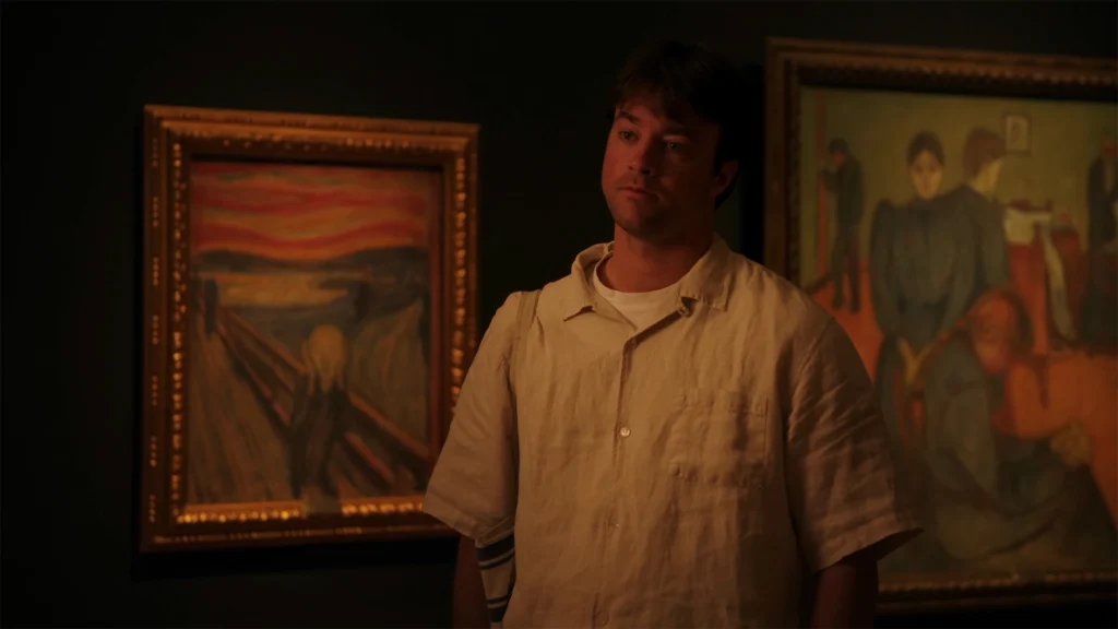
The news: Oslo’s marketing agency just released an ad that begins with the line, “I wouldn’t come here, to be honest.” It continues by ironically pointing out all the “downsides” to the city, like its walkability and public amenities. The spot is a tour de force in reverse psychology, using dry humor to spotlight Oslo’s appeal as a serene and wholly authentic vacation destination.
Big picture: The ad comes amid a rising trend called “tourismphobia,” which has cropped up across many European cities. Popular destinations in Italy, Spain, and France have been hiking up fees and fines for tourists (or even actively discouraging them from visiting) after rowdy groups have introduced a myriad of problems for locals.
Why it matters: Unlike some hot spots in neighboring countries, the Norwegian capital is still open to visitors—but the new ad demonstrates how marketing can be a tool to attract the right kind of audience. According to Anne-Signe Fagereng, VisitOslo’s director of marketing, the emphasis on the city’s sustainability goals and conscious way of life is aimed at doing just that.
(7)


