Virgin America’s New App Puts A Travel Agent In Your Pocket
Travel agents were among the first casualties of the Internet age, rendered obsolete by websites that let travelers select and book their own flights. But considering how time-consuming and complex it can be to hunt down the right seat at the right time and for the best price (be honest—how many airline tabs did you have open the last time you tried to fly?), some of us may be nostalgic for the golden age of travel in which your trusted agent knew your preferences—where you fly most frequently, window or aisle seat, first class or economy—completed the booking to those specifications, and bid you a polite bon voyage.
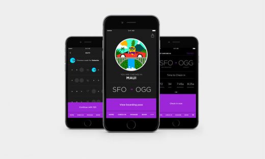
With its new app by the digital product design firm Work & Co, Virgin America aims to make booking and managing your flights as easy as it would be with a travel agent. It’s also designed to act like a concierge once it’s time to check in and board. The app launches in beta today and is expected to go fully public at the end of August.
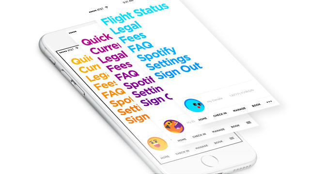
“Unlike other airline apps, we were focused equally on utility and beautiful design throughout the development of the [product],” says Luanne Calvert, Virgin America’s chief marketing officer. “We wanted to make sure that the app makes the booking process in particular simple, intuitive, and fast—but that it also makes our guests feel good and excited about their travel journey.”
Moving The Desktop Experience To Mobile
Two years ago, Work & Co overhauled Virgin America’s website, upending the user experience most of us come to expect when booking a flight.
Instead of the standard template most carriers have adopted—photographs of soaring planes and happy travelers, a slew of drop-down menus on a single page—the designers opted to dedicate a screen to every step of the process and remove the burden of making decisions wherever possible. User testing showed that this actually made the process faster and reduced errors since there was only one thing to focus on at a time. In lieu of stock travel images, quirky illustrations by the London-based studio Build punched up the otherwise Spartan scheme.
“How stress-free can you make it is part one, and that is where the strict UX stuff comes in,” Joe Stewart, a partner at Work & Co and lead on the project, says about what a good digital experience embodies. “But then the goal for everyone is trying to make something that you like using. That’s what you shoot for. Can you have used it and put it down and say, ‘Oh that was nice.'”
Many of the same best practices Work & Co developed for the website are at play in the mobile app, but are complemented by additional features that are better suited for an app. So while you can book a flight on both the app and the website, the app gives you extra layers of functionality in notifications, security, and ease.
“There are tremendous advantages for an app that a website just can’t do,” Stewart says. “One, the hardware is pretty incredible when you’re preloading so much of the code onto it. Speed is one big thing. And personalization is the huge one. The other big thing that customers have been clamoring for is day-of-travel stuff. That’s the primary reason you have a mobile app—checking in, getting a boarding pass, and gate-change information. All that ‘I’m going to the airport’ stuff and ‘at the airport stuff’ is where an app can do what a website physically cannot do. That’s where the magic is.”
Reinforcing, Not Reinventing, The Wheel
So while the website was a starting point for the app, Virgin viewed the new product as an opportunity to make the digital experience even better for customers. “We’ll be the first to admit that we’ve lagged in delivering an app to our guests . . . [but] when we do something, we do it right,” Calvert says.
The process of designing and developing the app took about one and a half years, due in part because Virgin America wanted to release iOS- and Android-native apps so that there would be as few bugs as possible.
When it came to the app’s core proposition, it was, like with the website, about making it as uncomplicated as possible for users.
“For every screen, it’s ‘What’s the least amount of stuff on there and is it legible?'” Stewart says. “One of the big problems with screens on an app is there’s no appreciation for space. You can really use negative space and the lack of stuff to instill a sense of ‘I can do this’ and calm so there’s very, very little here.”
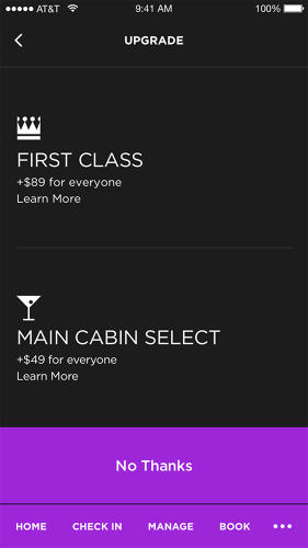
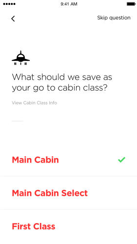
Reducing the number of steps users need to take to get to their end goal, whether that’s booking a flight or checking in, began with adding a layer of personalization to the app. Customers can set preferences for window or aisle seats, what class they like to fly, and their most frequent destination. They can also save credit card payment information (in the future there will be Apple Pay and Android Pay integration), which is more secure in an app than on a website. In-line form validation lets you know if you’ve entered information correctly and makes it easier to fix mistakes.
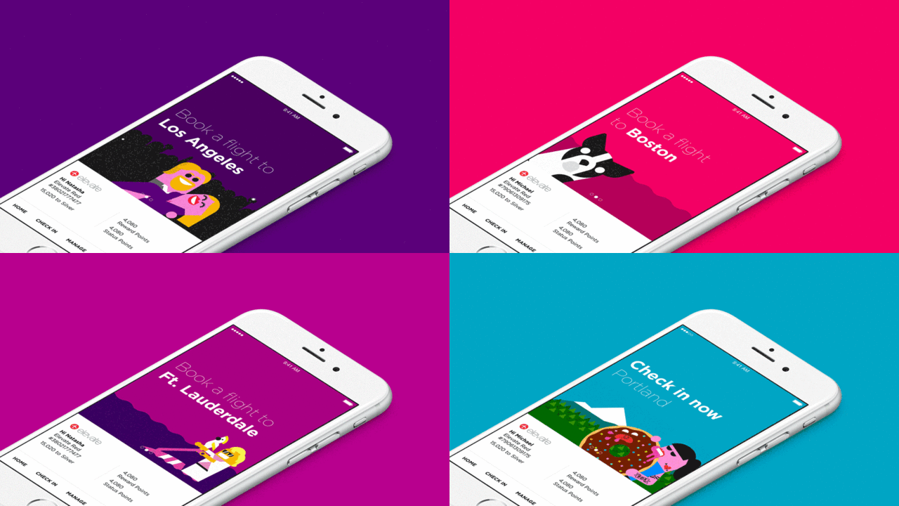
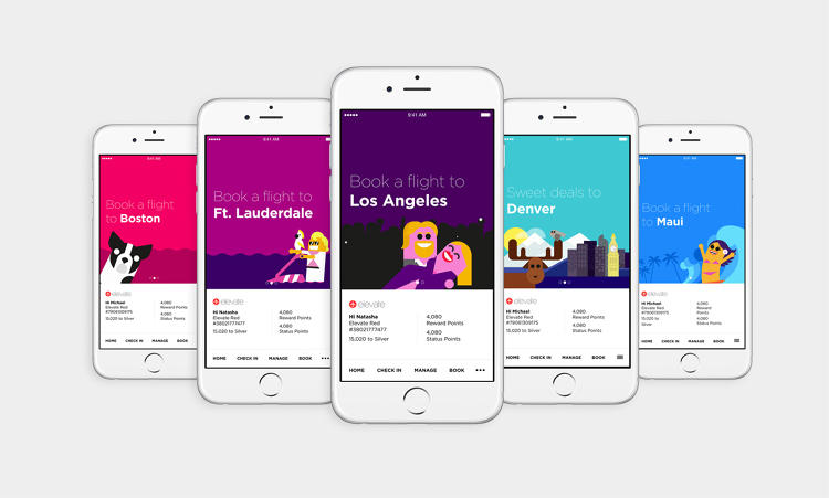
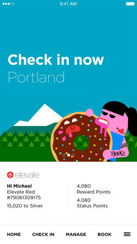
When users open the app, the landing screen is split in two. The top half is a carousel in which the first screen reflects what the app thinks you want to do based on your preferences, like booking a flight to Los Angeles if you told it that’s where you fly most. “In future states, it can be more predictive based on your behavior, but in this instance it’s an act of personalization,” Stewart says. Cycling to the next graphic reveals promotions, though marketing isn’t the end goal for the app.
“Virgin America understood that if you’re already using the app, you’re sold,” Stewart says. “You don’t really need to market to this person. They’re here to achieve a task, which is almost definitely checking in and secondly booking a flight—those are the two.”
The bottom half is all of the essential information most people like to see: their frequent flier number, reward points, and the number of points it’ll take for them to reach the next “status” level. (“Frequent flier miles are the original gamification [of airlines] and it really works,” Stewart says.) There are also shortcuts to the most common actions someone would need to take: booking, managing existing flights, and checking in.
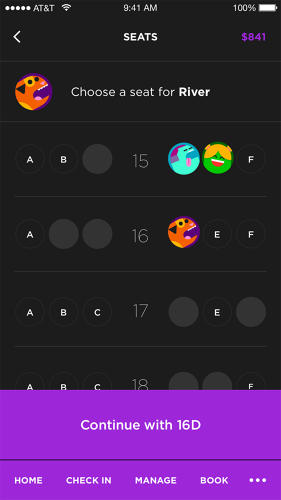
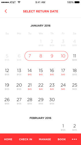
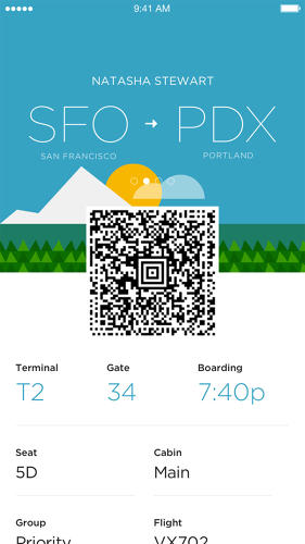
To book a flight, the app leads you through a series of steps just like the website, asking for your destination, date of travel, number of travelers, and type of traveler (adults, children, lap infants) before bringing you to list of flights for the day organized by price. If you’re booking a return flight, it then brings you to a calendar so you can see the lowest price for flights on the entire calendar month so users can price compare for that leg of your journey as well. The entire process takes about a minute. Once you’re done booking, you see a screen showing your flight information, a QR code, and an illustration themed to your destination. (Moose for Denver, doughnuts for Portland, and a man caught in the wind for Chicago.)
“I’m a big proponent of minimalism, the least amount of stuff that can be there in order for it to work is the correct amount of stuff,” Stewart says. “But that can get cold, so you kind of need to mix that with moments of fun.”
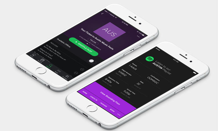
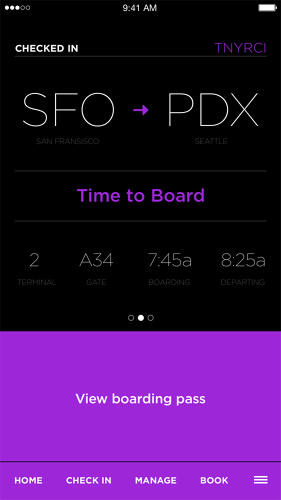
Twenty-four hours before your flight, the app changes into “serious” mode since it assumes the reason you’re opening it is to check in. The color scheme switches from a white background to a black background and gone are the whimsical colors and graphics users saw during the booking phase. It’s all text to help you check in as efficiently as possible.
Closer to your departure time, the app will tell you the gate location, keep you apprised of delays, let you know of any changes to your flight, and tell you when to board—just like having a personal concierge to tell you where to be and when. So if you’re perusing the newsstand, you don’t have to load a website and hit refresh to give you relevant flight info—the information comes to you, not the other way around.
The Business Savvy Behind The App
The digital presence of a company and brand is often the first thing customers experience. And while airlines have focused on ways to improve the in-flight amenities—like service trays, meals, and leg room—Stewart believes there’s a lot of headway still to be made on part of the journey that comes before getting to your seat.
“Customer service is one of the biggest factors in the impression that companies make,” he says. “The tip of the iceberg is buying a ticket and for the majority I think it’s largely ignored. A lot are doing the bare minimum and some aren’t even doing it at all in mobile. There’s not enough love there.”
For a small carrier, like Virgin America, which is in the process of being acquired by Alaska Airlines, every detail counts. “Virgin doesn’t fly to 500 cities, but these big guys do,” Stewart says. “So if they want to compete, the biggest way is though experience.”
In the mobile era, having a functional app that makes things easier for travelers seems like a no-brainer. “The shift to mobile bookings certainly continues to grow, and it is estimated by some that by the end of 2016 more than 50% of overall travel bookings will occur on mobile devices,” Calvert says. And as companies look for new ways to retain customers and increase satisfaction, it can be a competitive edge.
“There are so many ways to do everything and ‘I just like using this one better’ is a perfectly good reason to do it,” Stewart says. “It’s like streaming music services. A lot of them have very similar song databases, but you’re going to choose the one that you like using the most for whatever reason.”
So maybe you like funny illustrations, or maybe you’re more keen on booking things quickly. Either way, Virgin’s app aims to make the first step of your flying experience a great one.



Fast Company , Read Full Story
(54)

