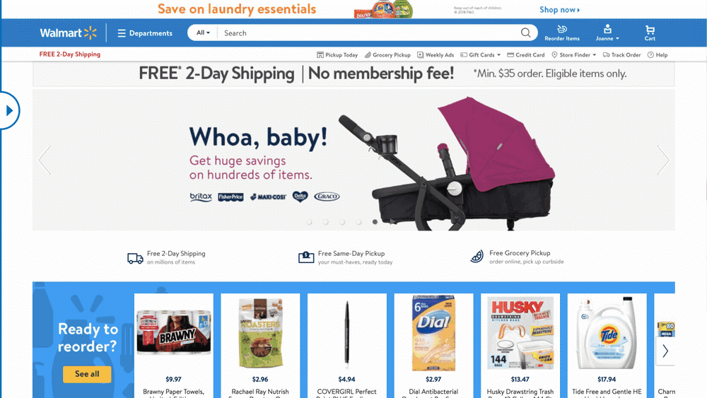
Walmart will roll out a cleaner, sleeker website in May
In a few weeks’ time, you might not even recognize Walmart’s website. The retail giant is giving it a total make-better — that’s a makeover in Queer Eye parlance — with what it says is “an entirely new look and feel.” Based on the image the company released with its announcement, we can expect a much cleaner interface with photos that look like they came from a lifestyle magazine. Walmart US e-commerce chief Marc Lore said, they’re featuring relatable photography to “bring a more human element to the site.”
According to The Wall Street Journal, Walmart execs decided that it was time for a sleeker look in order to appeal to higher-end brands, so it can expand the range of products it offers. The cleaner look was also meant to entice people to browser more products — indeed, it’s as if a hoarder has finally cleaned up and decluttered. You’ll also notice that the website isn’t so blue anymore.
In addition to a more polished look, Walmart’s new website will also offer a quick way to repurchase items you’ve bought before. It will highlight the top-selling items in your area, as well, so you’re not the last person in the neighborhood to find a good deal when it’s too late. Walmart’s execs believe that bringing in more expensive brands and making sure people are spending a lot of time on the website can make the company’s e-commerce business more profitable. Whether the higher-end feel can help Walmart pull customers away from Amazon’s more cluttered, pretty chaotic website, however, remains to be seen.

(32)


