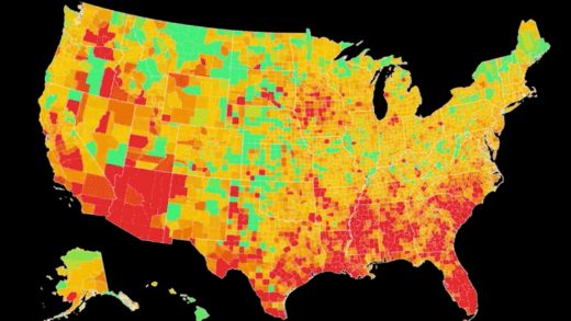
Watch how and where COVID spread across the United States in 22 seconds
The United States just passed a grim milestone. According to the latest data from Johns Hopkins University, 200,000 people have died from the coronavirus, the highest death toll of any country on Earth.
To get a sense of the scale and speed with which the COVID-19 pandemic has wreaked havoc on this country, the team of scientists and technologists at Covid Act Now released an animated map showing how and where new infections spread. The color-coded animation takes you from early March until the end of last week, showing hotspots in deep red as they move from limited sections of the Northeast and eventually envelop large swaths of the West Coast, Southwest, and Southeast.
With its green-to-red color scale, the graphic is richer and more revealing than the typical COVID map animation where you might see, say, a flood of red dots spread across the country like drops of blood. Here, you can actually see how infection rates rise and fall, providing context about where hotspots arise and how long they last. In a way, it’s offers a small glimmer of hope: One day—even if it’s far off in the future—this map will be more green than red.
Check out the full animation below. The whole thing takes 22 seconds.
We visualized COVID’s spread across every US state and county. Check back this week to see what we discovered. pic.twitter.com/aJytZwHTew
— Covid Act Now (@CovidActNow) September 21, 2020
(55)


