Webflow Builds Sites Without Code, Like Squarespace Crossed With Photoshop
When design and code combine, building websites may never be the same.
Right now, the web is split between designers and developers. The designers mock up layouts in Photoshop. The developers turn that imagery into functional code via standards like CSS and Javascript. As a result, designers have three options: just use a turnkey platform like Squarespace (and sacrifice a unique design voice), learn to code themselves (which isn’t necessarily their specialty), or constantly pay for coding services (which ultimately makes web development slower and more expensive for the client).
But now Webflow—a three-year-old Y-Combinator-born web design platform with 45,000 regular users—is introducing an enticing fourth option. It’s what they’re calling a visual content management system (or visual CMS). And it basically allows you to create complicated, responsive websites without ever setting up a server, and that can be readily updated with new photos, text, and other media without a coder involved.
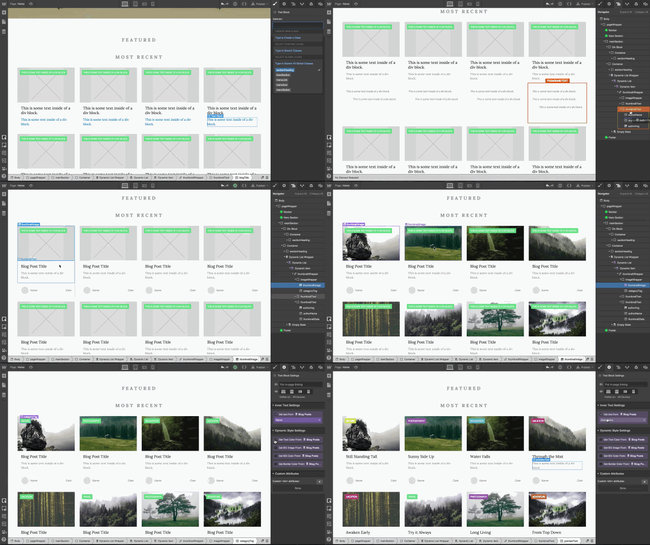
“Designing and editing the content is done completely visually, without code,” explains Webflow cofounder Vlad Magdalin. “Designers absolutely have the skills to think about how content is structured and how it’s presented to users. All we’re doing is democratizing this process so it’s all done singlehandedly.”
How Webflow actually works, Magdalin admits as he demos the software for me via video chat, is tougher to explain. The core service looks a bit like Photoshop or Illustrator, but right in your web browser. A large toolbar allows you to drop in headers and photos, tweak white space, or even create bespoke animations on your site. Webflow’s Dynamic Data Manager update, which launches today, adds an underlying logic to everything you see.
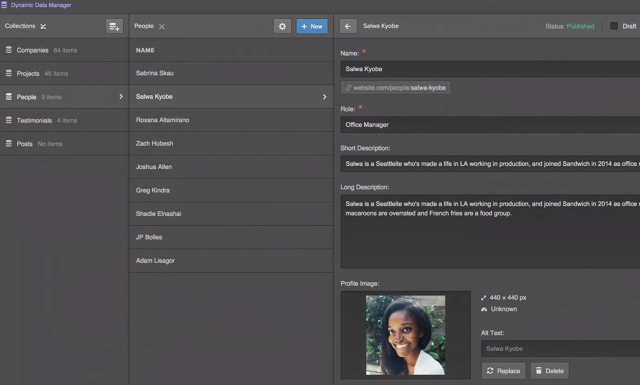
The Data Manager enables a designer to build this underlying logic through categories. If designing a site for a startup, they might have a category for People so you can meet the team. Within People, each employee could have their own entry with a photo and a blurb. From the backend, these entries look like any CMS you know. They’re text fields with a photo. No big deal. But once created, they can more or less be drag-and-dropped to appear and be reconfigured anywhere on the site. And if you ever want to update someone’s title? You can do that right from the front end. So you’re literally looking at the website itself—not some entry in the CMS—as you tap someone’s title, and you delete the old title and type a new one. Not only does this new title appear right on the page, but anywhere else that particular person was featured across the site, their title will be updated, too. As confusing as this workflow may sound, that’s the power of having the database of your site cooked right into the design itself.
What this means in practice is that the stagnant small-business website of today can be a much more interactive, constantly updated thing. Instead of just embedding a PDF of a menu, or coding it out once in CSS, a restaurant could feasibly have every menu item live on the page as a dynamically arranged and updated entity—that, by the way, can be easily tweaked for desktops, tablets, and mobile, too.
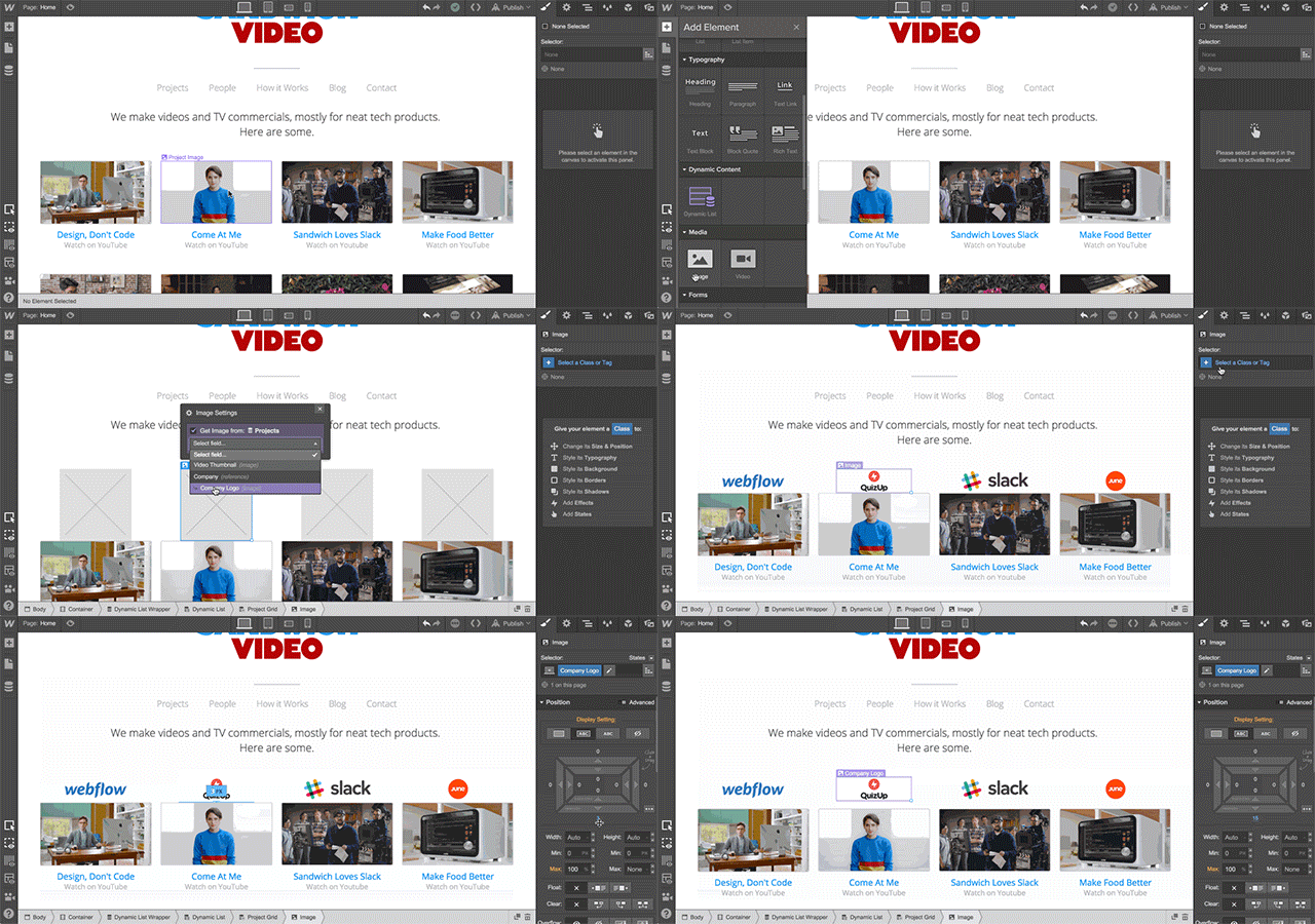
Each dish would be likable for Facebook. The top-ordered items could be rearranged every week. Special pages could highlight gridded photos of vegetarian items, while other pages featured full-bleed hero shots of steaks. Many of these changes would even be simple enough for the restaurant’s owner to make the updates if they didn’t want to call their designer, but hopefully the changes are so simple to make that they’re a low cost for everyone involved.
“Our market is freelancers. Either a single person designing websites for clients or a small agency. These are sites [that] designers are charging tens of thousands for, but they’re also spending tens of thousands to have developers implement the sites,” Magdalin says. “Over time, we want the cost of these complex sites to come down so that more businesses can afford these rich sites.”
As a promotional stunt, a Webflow designer recreated the tech blog TechCrunch in just a few hours. But the company isn’t aiming to woo the publishing industry. Over the next year, Magdalin has grander plans for Webflow than empowering the next wave of Buzzfeed listicles. Now that it has visual logic tools in place, he imagines that with a few more updates, designers could use Webflow to build entire actual startups.
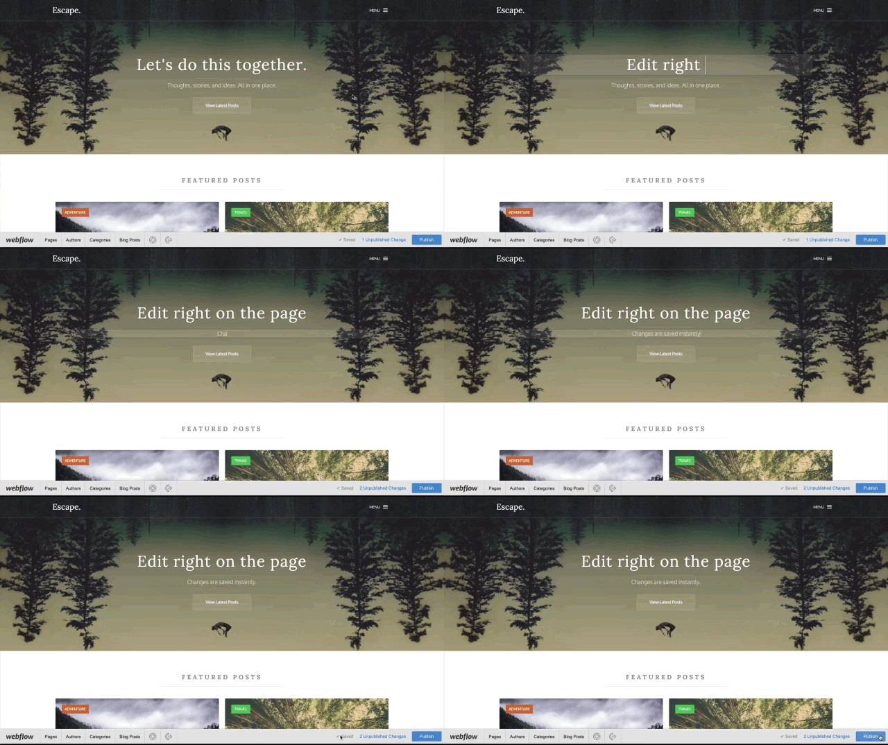
“For Airbnb, they [really] have two things: people and listings. And listings have a title and image gallery,” Magdalin explains. By this logic, a Webflow designer could build Airbnb today, save for one big piece: Webflow lacks any options for handling user-generated content, like comments and ratings, which is what the team is building out next.
If you’d like to get started in Webflow, the basic plan is free, but be prepared to face a learning curve. With tutorials the company provides, Magdalin says it takes a few weeks to get comfortable using the product. Your site’s information is stored and backed up on Amazon’s servers. And if you ever leave the product, you can export your database for future use, along with the CSS and HTML of your site.
Correction: An earlier version of this story incorrectly stated that you couldn’t export your site’s design.
Fast Company , Read Full Story
(133)

