What eight Google products looked like when they were brand-new
A lot can change in 20 years. Helpless newborns become campus-dwelling scholars, carefree twentysomethings turn into responsible adults, and tiny tech startups grow into colossal corporations—complete with sprawling portfolios of polished products.
Yes, indeed: Just as hominids mature over the course of two decades, Google—which is officially marking its 20th birthday on Thursday—has undergone quite the dramatic transformation since its founding. Heck, even Google products that launched 10 years ago are now barely recognizable from their infant forms.
Related Video: Over its 20 years, Google has revolutionized the world
Let’s take a journey back through time to see how some of the company’s most popular products looked at their onset—and just how far they’ve come to reach their current-day states.
Google.com
Google.com—the website and search engine, which represented all Google had to offer in the beginning—began as a research project called BackRub, the brainchild of Stanford PhD students Larry Page and Sergey Brin. Once it had morphed into Google, early versions of the site sported a bare-bones page with plain text stating, “Welcome to Google” and links to both a regular search engine prototype and a more advanced “might-work-some-of-the-time” version.

Clicking the link for the regular prototype took you to a sparse page with a rudimentary version of the Google logo (complete with a Yahoo-style exclamation point at the end, so you knew it had to be exciting!). The page boasted that the nascent search engine held around 25 million pages—a number “soon to be much bigger,” the company promised.
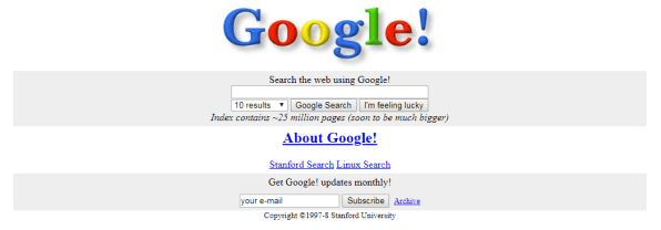
And it wasn’t lying: As of two years ago, Google was up to a whopping 130 trillion pages, according to Search Engine Land. Today, the company is a touch more modest, with a public estimate that its index holds “hundred of billions of web pages” amounting to more than 100 million gigabytes of data.
Oh, and that 1998 link to the “might-work-some-of-the-type” prototype? It pulled up—what else?—a beta version of Google’s namesake service.

Gmail
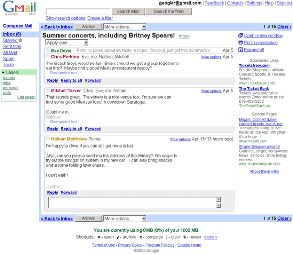
When Google announced Gmail on April 1, 2004, plenty of folks thought it was a joke. The company was known for its April Fools’ pranks, after all, and the official Gmail announcement seemed suspicious both for its then-outrageous-seeming claims (a whole gigabyte of storage—per user?!) and for the silly-sounding tone with which it was written.
In reality, of course, it was no laughing matter: Even in its earliest forms, Gmail reshaped expectations for what a web-based email system should be—not only with the amount of storage it offered, but also with its focus on search and its conversation-like organization of threads.
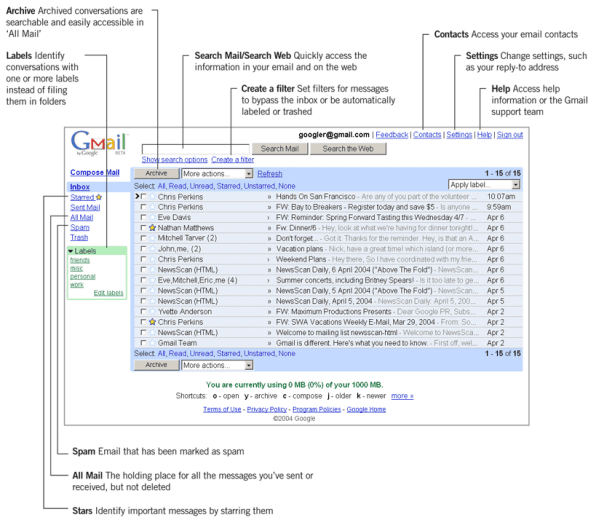
The concept of archiving messages instead of deleting was wild at a time when most webmail services were providing mere megabytes of storage. From the get-go, Gmail gave users tools for managing this ever-expanding history of communication, such as the service’s unusual label system in place of folders, its trademark “All Mail” section, and its superb and supremely speedy search technology.
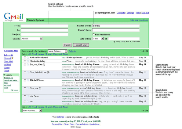
Then there were the ads—a point of contention among privacy advocates from the very beginning. (Google stopped scanning email for ad targeting in 2017, but continues to show ads in parts of the Gmail interface today.)
Google Talk
Google’s messaging app saga kicked off with the advent of its Google Talk client in 2005. Talk was initially released as a Windows-only application, though non-Windows users were also able to access the service via an array of third-party clients.
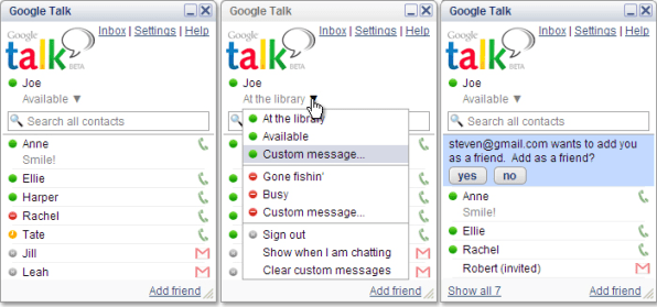
The first Talk client let you connect with anyone from your Gmail contacts—a “great way to communicate with your friends without having to leave your computer,” as Google put it at the time. The app even included an internet-based calling feature that promised to make your voice sound “a lot better than it does on answering machines” (what a relief!).
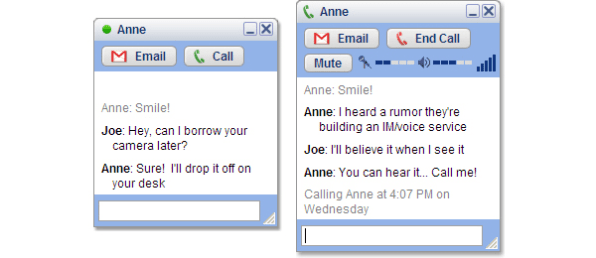
Before long, Google Talk got integrated into Gmail, where it was frequently referred to as “Google Chat” or “gChat” by users (though no services with those names technically ever existed). Talk eventually merged with Hangouts, which is now slowly being transitioned into an enterprise product while Android Messages—and, to a lesser extent, Allo—takes over the main messaging role.
Google Maps
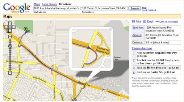
Maps found its way into Google’s product portfolio in 2005, back when MapQuest was the industry leader and printable text directions were the norm. Maps’ earliest design introduced draggable, interactive maps that loaded almost instantly as you moved your mouse around—a now mundane-seeming detail that was anything but ordinary at the time.
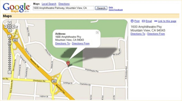
From day one, Maps allowed you to search a neighborhood not only for business names or addresses, but also for vague concepts such as “banks,” “pizza,” or “Wi-Fi hotspots” (and remember, this was 2005—when mobile data access was a rarity, and public hotspots were still relatively tough to find).
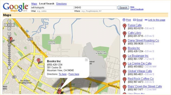
And, of course, Maps’ biggest innovation: The service empowered you to see step-by-step directions as an overlay on an actual map. It was, dare I say, revolutionary.
YouTube
At its genesis, YouTube didn’t look much like the service we know today. The earliest available screen shots, from 2005—when YouTube was still an independent effort—show a sparse site centered on video dating. Users were encouraged to upload videos of themselves and then search for potential matches.
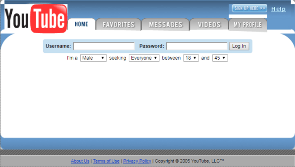
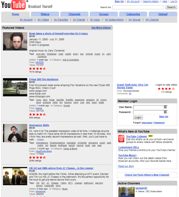
Within a matter of months, though, the site had pivoted into more familiar video-library terrain. And by the time Google acquired YouTube in 2006, the service was using the slogan “Broadcast Yourself”—an identity it’d stick with through 2012—and sporting an entertainment-centric setup that put creative and often wacky user-made videos front and center.
Google Docs
Google Docs grew out of a buzzworthy web-based word processor called Writely. Google bought the app in March 2006, when Microsoft Word was the undisputed productivity champion and web-based alternatives were barely a blip on the radar. The company continued to operate the app under the Writely name through that October.
In those early months under Google’s wing, Writely didn’t look much like the Docs we know today:
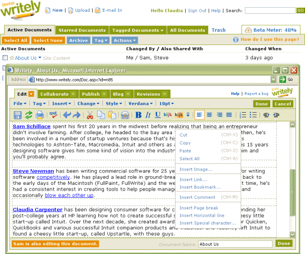
Once Google combined Writely with another app it had acquired and been operating as an experimental version of Google Spreadsheets, however—bringing both entities under the Google Docs banner—everything took on a more recognizable form. Still, the Docs interface remained decidedly basic and its function set limited, with a focus mostly on the service’s standout collaboration system.

The company’s cofounder even told CNET the “last thing” he wanted his app to do was to “compete with Microsoft head-to-head”—a mind-set that clearly wouldn’t last for long.
Google Calendar
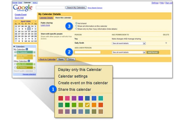
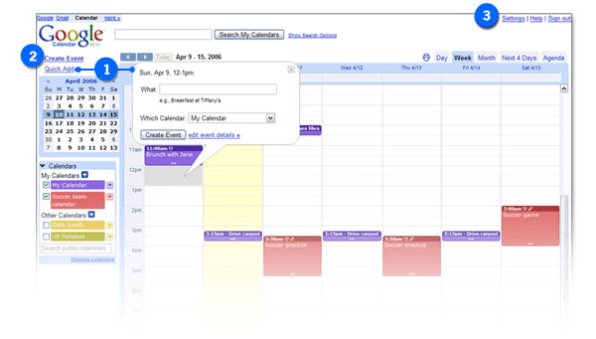
Unlike the other products in this story, Google Calendar’s early design—at the service’s launch in 2006—probably looks pretty familiar. That’s because the app didn’t really evolve all that much until its long-awaited redesign just last year.
These images from Calendar’s 2006 product tour should bring back some not-so-distant memories:
Android
Last but not least, a Google product that’s undergone one of modern tech’s most dramatic evolutions: Android. Android’s first public release, in 2008, didn’t even have a dessert-themed code name—but it did have a customizable home screen complete with wallpapers, shortcuts, and a limited range of system widgets.
Notifications and multitasking were key focuses for the platform even back then, though things looked just a teensy bit different from what we’re used to today.
It wasn’t until the following year’s Android 1.5 Cupcake release that foundational elements like an on-screen keyboard, voice input, and video recording made their way into the platform.
All of that may seem like a lifetime ago, but it was a mere nine years in the past—a powerful reminder of just how quickly technology has progressed, and how different the world was when Google and its various products first came along.
(46)

