The internet is an invisible energy hog. We read CNN news headlines on Facebook. We calculate our Chase interest payment in Google’s search bar. But peel back that convenient user interface, and it’s all actually a bunch of servers—computers in giant, climate-controlled warehouses that gobble up energy—calculating and cross-referencing one another every time you like, search, or surf. These data centers consume as much as 3% of all global energy today, as part of a larger infrastructure of phones and communications networks that could consume 21% of all energy by 2030.

[Image: courtesy Normally]
Something needs to change, but what? That’s a topic being explored by designer Tom Jarrett at the U.K. design studio Normally, in a research project called Post Abundance. The firm is trying to imagine how we might redesign the internet itself to require less energy. And what Jarrett developed is a version of Instagram that’s conscious of its own energy greed and carbon footprint—one that looks and feels a lot like the Instagram you know, but instead of providing an unlimited buffet of photos and videos, it nudges you to nibble on its content rather than binge.
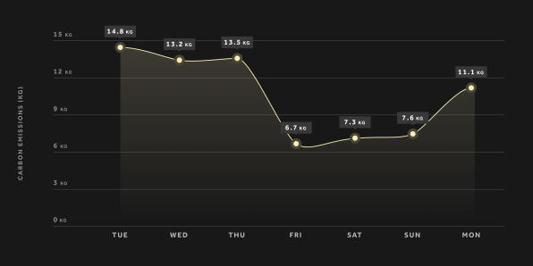
Jarrett started the project by examining his own personal online electrical footprint. He installed Carbonalyser, a Firefox plug-in that measures energy consumption and greenhouse emissions from the web (technically, the tool uses an internet energy model developed by the French energy think tank The Shift Project). After a week with the tool, Jarrett was surprised by what he found. Not only was his one-week carbon output the same as taking a flight from London to Zurich; he also learned that e-commerce sites sucked more energy a minute than Netflix. But his worst offender by category was social media, which accounted for more than a third of his energy consumption.

[Image: courtesy Normally]
As Jarrett tells me about his project, he brings up an apt point of comparison: the automobile. Cars are bad for the environment, sure, but there are practical limits built into them. They require your time and attention. You have to fill them up with gas. You have to answer to your nerves if you drive too fast. And a car will always move you through space somewhere that will probably require a return trip. These limitations might seem obvious, but they’re exactly why you are reading this article on your computer or phone instead of driving to Florida on a whim right now.
The internet, on the other hand, has no limits. You can consume it from your bed, as much as you’d like if your phone has a power cord. And especially when that content involves your friends, family, and countless celebrities, as on social media, there’s always more to see.
What Jarrett wanted to do was leverage an existing user interface to add physical limitations back to the experience, to turn the internet into something more like a car. “But I was a bit wary . . . it shouldn’t be about shaming people for watching YouTube videos,” says Jarrett. “We’re the tech industry, the design industry, the people looking to build platforms.”
So he imposed limitations on Instagram and used UI tricks to curb its energy usage. One intervention blocks images on Instagram, instead presenting them as a gray box. That box is not completely useless. An image recognition algorithm (which already identified the photo in the cloud or on someone’s device when the photo was taken, so that power was used) would describe what you would be looking at, like, “a cup of coffee and croissant on a wooden table.” So Instagram would only need to beam you a few words rather than a high-resolution image.
If you’d like to see the photo, you tap on it. But before doing so, you reference a small icon in the upper-right-hand corner, which signals how much energy it requires. As you look at more images, you fill your own meter, which is depicted in a very on-brand, colorful gradient bar on top of the feed.
Is the idea of browsing Instagram for words rather than photos silly? Perhaps! Jarrett agrees with me that there’s something about reading, “a cup of coffee and a croissant on a wooden table” that instantly channels the Instagram brag aesthetic so crisply, and as such a recognizable cliché, that it questions whether or not we should even be posting these images in the first place.
In any case, Jarrett is not trying to get you to quit posting on Instagram, or even suggesting that he has found the solution to our energy-hungry addiction to these services. For now, he’s still pondering the question, and hoping that his work can highlight how adjusting the UI of social media could meaningfully impact its environmental footprint.
“I could envision a switch where you turn off the noise and have a more calm experience . . . and there would be a mental health aspect to it all as well,” says Jarrett. “Platforms could introduce something quite revolutionary.”
Fast Company , Read Full Story
(40)