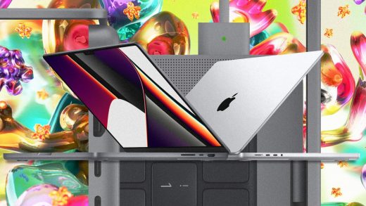
What’s old is new: Apple’s latest MacBook Pro proves that novelty is overrated
I work every day on a $2,600 MacBook Pro. And the fact of the matter is that I like this MacBook less than I liked any of my previous MacBooks, all the way back to my first one in 2005.
That’s because, beginning in 2016, Apple killed some of its most beloved features in its MacBooks—features that went back a decade or longer. But with today’s announcements of new 14- and 16-inch MacBook Pros, what’s old is new again. Apple has rewound Pro’s industrial design to its 2015 (and earlier) designs.
It would be easy to focus on Apple’s about-face as hypocritical or backtracking. But the truth is that Apple made a difficult decision here: It threw out a lot of newer ideas to prioritize what I’d argue is timeless UX.
Magsafe
Let’s begin with the assassination of the Magsafe power connector. No one complained about the Magsafe since it was first debuted in 2006. It solved an important problem: If you tripped over your laptop’s cord, your laptop would stay put on your desk, rather than fly onto the ground. As an added bonus, Magsafe made it easier to plug in your laptop. The old Macbook Pro actually sucked the wire out of your hand, and positioned it perfectly in the charging port.
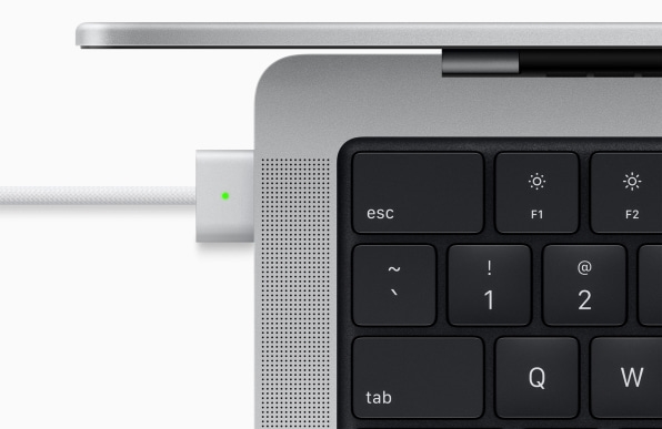
In 2016, Apple swapped Magsafe for a USB-C port to carry the power. On paper, this might have seemed like a smart decision. Magsafe was patented and proprietary. Meanwhile, USB-C was universal. In theory, the USB-C MacBook Pro could be supported by a whole ecosystem of charging cables and batteries. And while that proved true, Magsafe is a hands-on-ears superior approach to charging. USB-C can pull your laptop off a table. USB-C requires you to line the plug up and jam it in with the right amount of force. Simply put: Every single time I plug in my MacBook feels worse than it used to, so it’s great to see Magsafe back in more than just iPhones.
The keyboard
Apple has been under fire since 2015 when it phased out its classic scissors-switch keyboard for its butterfly keyboard design. These differences aren’t much to be seen; they refer to the specific mechanisms that allow your keyboard keys to be pressed and pop back.
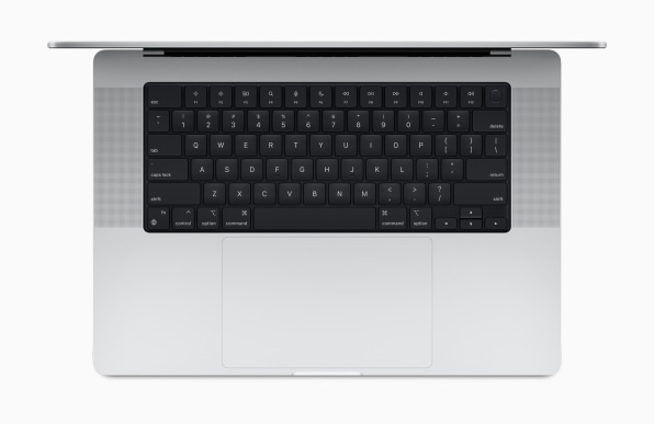
The butterfly allowed for a keyboard that was 40% flatter than previous keyboards. But these thin keyboards were prone to failure (keys just stopped working, which required the keyboard to be replaced, or for someone to just replace their laptop entirely). As a result, Apple slowly reverted back to its old scissors-keyboard mechanisms in 2019 and 2020 while facing a class-action lawsuit.
But the new MacBook Pro does something else that’s important: It brought back its physical line of F keys (the “function” keys that brighten your screen or do other specialized tasks), abandoning the Touch Bar. As Apple explained during the event, these keys “bring back the familiar tactile feel of physical keys that users love.” As we noted in 2016, when Apple first introduced the Touch Bar, that was exactly the problem with the design. The greatest advantage of laptops over tablets or phones is their physical buttons that you can operate with muscle memory, and Apple swapped those out with a strip of buttons you had to look at to use.
Now, much like USB-C charging, the Touch Bar did attempt to solve a greater design problem: How do you customize a laptop’s interface for each app with the same fluidity we have in our phones? But bottom line, Apple’s solution just wasn’t it. And frankly, I’m not sure that problem was all that problematic to begin with. Yes, it’s tricky to learn keyboard shortcuts. However, it’s even trickier to master a keyboard when the keys are constantly moving on you. Even if there is something useful on the Touch Bar, my eyes are always on my computer screen. I can’t think of a single app where I thought, “Thank goodness I have this Touch Bar!” It was a technological solution to a design problem, which made it feel remarkably un-Apple in the first place.
Apple recycling Apple
This isn’t the first time Apple has recycled its ideas. The iPhone 12 and 13 feature a blocky, metal-wrapped chassis that’s basically a rehashed iPhone 4. However, I see that decision as seasonal, a way to bring back an old fashion after the right amount of time has passed to make the old feel new again.
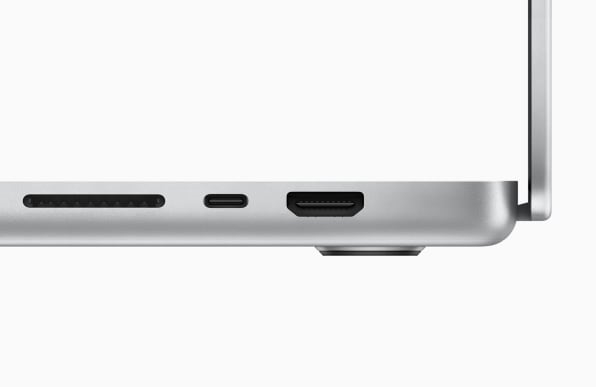
With the MacBook Pro, Apple is going retro in the name of user experience. Apple is pruning back its own design, finding the essence of what made its laptops so easy to use and lovable—even if these ideas are more than a decade old.
We view some objects—certain chairs, sunglasses, buildings, and cars—as classic designs; things that are so perfectly articulated that they need no further fix. It’s rare that we say the same about electronics, because microprocessors shrink smaller and process faster every year. Newer gadgets tend to be smaller, lighter, and simply function better than old ones as a result of circuit board-level improvements and ever-evolving code.
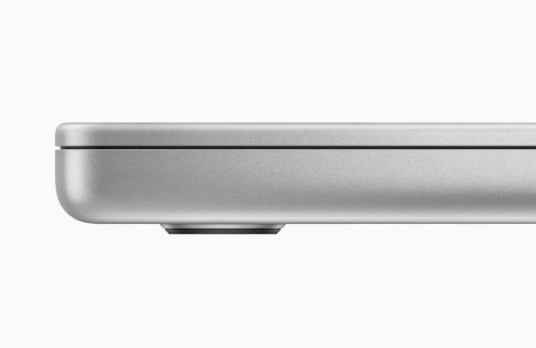
But perhaps it’s time that we induct the MacBook Pro into the rare air of perfectly designed products. Apple can keep speeding up its processors, improving its cameras, and swapping out materials for greener alternatives. It can tweak the screen-to-case ratio, squeeze in a larger battery, or adjust the curves of its silhouette year to year.
However, at its core, this aluminum-bodied keyboard with a screen, coupled with a handy power cable, meets all of our fundamental ergonomic needs with restrained elegance. The new MacBook Pro is not attempting to do a thing that it cannot do perfectly. And in that way, yes, it’s a lot like that old MacBook Pro, the one you bought somewhere between 2008 and 2015, that many of us still love.
(26)

