Where did you travel in the last decade? This personalized map will show you
As we approach the year 2020, we’re inevitably reflecting on the last decade of our lives. The music heard, romances had, and the jobs taken. The accomplishments, the regrets, the absurdity. Where did the time go? And where did you, you know, actually go?
These days, there’s more than one way to reminisce. Thanks to the modern surveillance state that is Google, and the marvels of modern data visualization, you can actually map the last few years of your life. The Location History Visualizer heatmap is a totally free and private tool that can import your location data stored by Google, then chart that onto a global map that shows where you spent the most time.

It’s actually quite easy to export your data from Google: Just go to Google Takeout, uncheck everything except “Location History,” and download the .json file. Then, you’ll upload that file to the site—which renders your map locally, meaning that no third parties will spy on your results. I was able to create my map in less than five minutes of clicking.

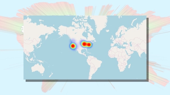
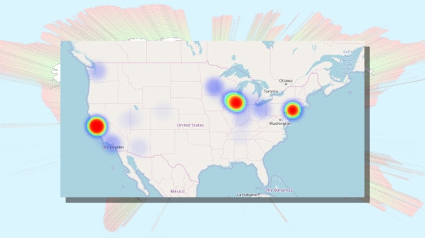
What I saw was a data portrait worth the effort. The last decade or so of my life is spread across three cities that each glow like a psychedelic bull’s eye: Chicago (my home), New York (my work), and San Francisco (where I’ve visited so frequently reporting stories over the years, it might as well be considered my other place of work). Aside from those three hot spots, a blue haze floats across the map from vacations and other one-off trips. My story is absurdly simple.

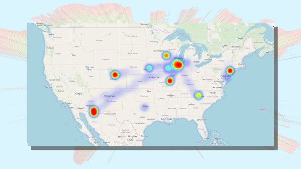
Your story, however, may be a lot more interesting. A colleague shared her map, which has so much variety that the U.S. looks like it has chicken pox. One surprising point was that she could even see the blue trails that took her from one city to the next. Why don’t I have these same blue trails between my cities? I rarely connect to the internet in the air, and she does. Presumably, that’s why her location was being recorded by Google services, even 30,000 feet in the air.
If you set aside the creep factor involved with Google knowing everything about you*, Location History Visualizer offers a nice value add for all that ubiquitous location tracking. It’s like your own mini data portrait, akin to those that were popular a few years back (like the Feltron Report). In case you want to get even more granular, a pro version is available for $60 that allows you to see exactly where you were, at any time, down to the minute. My life is not interesting enough to justify that sort of financial or time investment. But maybe yours is.
* Or don’t, and just purge your data altogether through this link.
(44)


