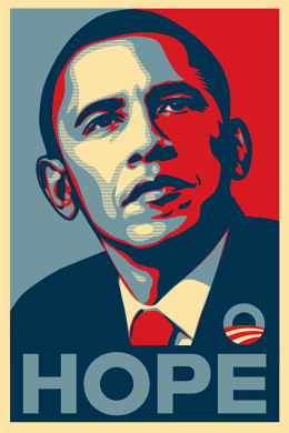
In 2008, the artist Shepard Fairey created an image that would become the symbol of an historic election: Obama, eyes cast upward, face sketched with red, white, and sky blue, and the word “Hope” proclaiming the message of his campaign and the promise he held for the United States.
“It captured everybody’s beliefs at the time that there was real hope in the air with this African-American nominee, this historic moment, this heroic portrait of the man,” says Steve Heller, the cochair of the design program at the School of Visual Arts. “It was the first one that spoke to the postmodern generation, even though it echoed the social realism that came long before it. But there he was. It was a heroic gesture, a heroic stand.”
Eight years later, an image has yet to capture the ethos of either presidential candidate—another historic candidate and a much-ridiculed businessman with no political experience—in the way that the “Hope” poster did.
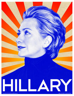
“They may be well-designed and visible like Tony Puryear’s Shep-baiting Hillary poster also from 2008, or humorous and iconic like the Bernie hair silhouette, but they’re not adding anything soulful or artistic to the conversation this cycle,” says Matt Ipcar, who was on the Obama campaign’s design team in 2008 and is now the creative director at Blue State Digital.
The 2016 election could be a turning point for the country. As Shepard Fairey told me, “This has been one of the most acrimonious periods in American politics that I can remember.” So why haven’t graphic designers or artists managed to create an image that emblematizes this critical electoral fervor?
THE CANDIDATES THEMSELVES ARE DIFFERENT
First of all, the two candidates make for less compelling subjects, according to Steven Seidman, the author of Posters, Propaganda, and Persuasion in Election Campaigns Around the World and Through History. Seidman says that Bernie Sanders had the best chance of having an iconic image made of him because he was the most progressive candidate and attracted support from young people, activists, and plenty of people in the arts.
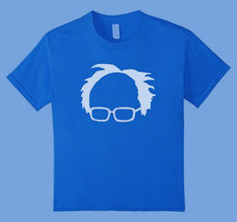
Bernie fired up the imaginations of America’s young people and many artists, but Hillary Clinton’s primary campaign didn’t evoke the same kind of passion. And now, as the party’s official nominee, it remains difficult for an artist or designer to capture her in a way that’s novel enough to become iconic because she has been on the political scene for so long.
“The fact is you have to undo some of the cliches that have been created about Hillary. She’s better off with her logo instead of a poster of her,” Heller says. “Everyone knows what she looks like—it’s not what she looks like that we’re voting for.” Instead, Clinton’s campaign has focused on strong, simple slogans like “Stronger Together” and “I’m With Her” rather than any portrait-style imagery. It’s a smart move, especially considering the cultural double standard that forces to Clinton to face regular criticism because of how she looks.
But Clinton isn’t waiting around for an iconic image to emerge from the ether. Her campaign already asked 45 top designers to contribute campaign button designs as part of the aptly named Forty-Five Pin Project, though it remains to be seen if any of the designs will become one of the election’s iconic visual emblems.
According to both Seidman and Heller, history shows that liberal candidates are more likely to inspire the nation’s artists. But Trump is ripe for artistic parody, from the street mural of the Republican nominee kissing Vladimir Putin to painter Illma Gore’s nude Trump. However, the real Trump’s orange hair and puckered mouth have become more iconic than any one image of him. He is so much of a caricature that few artists have managed to truly capture the egoism and fear-mongering of his speeches and sound bites.
“The Trump campaign definitely doesn’t get it,” when it comes to imagery, Ipcar says, or even the visual aspects of branding. (The campaign recently backpedalled on its new logo after it was widely mocked online.)
POLITICAL IMAGERY—AND THE WAY WE CONSUME IT—HAS CHANGED
But it’s not simply the candidates that aren’t as conducive to an iconic image. The way the public absorbs imagery has changed dramatically over the past eight years—and the way campaigns create it is different, too.
“The fact that we see these people on a 24-hour news cycle is making it more difficult to capture the essence of the candidates,” Heller says. Posters are simply less significant than they used to be, when they were the “only extension of the candidate into our minds.” Even when they go viral, the competition for attention is much fiercer. Still, Heller believes that “every image serves a purpose if it hits the right note.”
Though social media played a major role in the “Hope” poster’s cementation as 2008’s iconic image, this election has seen the public engaging with campaign imagery on social media in a much more interactive way.
For example, the Clinton campaign’s “Trump Yourself” app, in which Facebook users can superimpose Trump’s insults onto their own pictures—”Fat Pig!”, “Hater and Loser!”, and “Total Lightweight, Sad!” to name a few—had 2 million people use it on the first day of its release.
The “Trump Yourself” project is part of a larger trend that has seen political campaigns and activist causes encourage individuals to personalize their support online. Whether that’s putting a rainbow flag over a profile picture after the Supreme Court legalized gay marriage or making your own Ice Bucket Challenge video to raise money for ALS, these individualized, interactive campaigns are conducive to sharing—and have dramatically changed the way people express themselves politically online.
WHY FAIREY ISN’T EVEN TRYING
Shepard Fairey is producing a new set of posters for this election cycle, but rather than focusing on any one candidate, he decided to make art about specific issues.
In partnership with the estate of the renowned photographer Jim Marshall, Fairey used Marshall’s photographs as the starting point for a series called American Civics that addresses income inequality, gun violence, mass incarceration, voting rights, and workers’ rights.
“I felt like it was an important time to work on this stuff while people are paying attention to politics,” Fairey says. “The reason I went with more specific images about more specific issues is that I think as a country we’re frequently into this reality TV show that plays out as part of the political process. We’re not about understanding the dynamics of the political system or the dynamics of the issues themselves.”
Social media has also affected his decision to focus his art on the issues rather than the candidates. “Vilifying Trump or championing Hillary would be part of a culture—that includes the media and social media—that leaves people less informed and less empowered to make good decisions,” he says. “It’s a culture of oversimplification.”
Still, if he had to made a “Hope”-esque poster of Trump, it’d say “Ego” across the bottom. For Hillary, it’d say “Experience” or “Tenacity.”
The most intense campaigning is still ahead of us. But even if an image manages to stick around longer than a week on social media, there’s no telling what will become iconic until after the fact. The “Hope” poster may have been a once-in-a-generation image. As Seidman puts it, “nothing will be like the Shepard Fairey ‘Hope’ poster again.”

Shepard Fairey x Jim Marshall, Voting Rights, American Civics Series, 2016
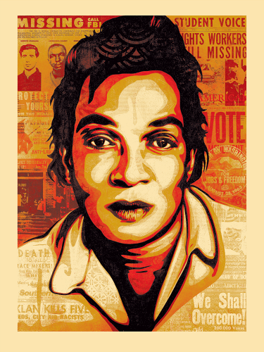
Shepard Fairey x Jim Marshall, Mass Incarceration, American Civics Series, 2016
Johhnny-Cash-American-Civics
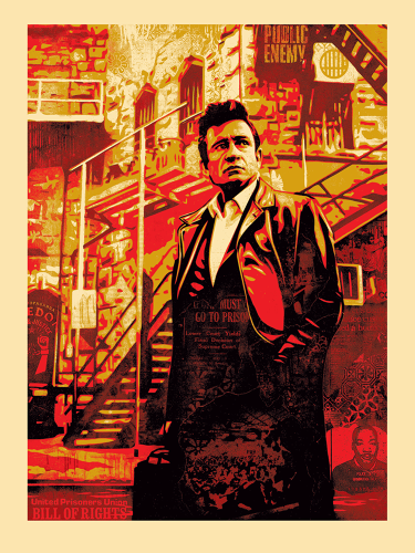
Shepard Fairey x Jim Marshall, Two Americas, American Civics Series, 2016
Hazard-Family-American-Civics
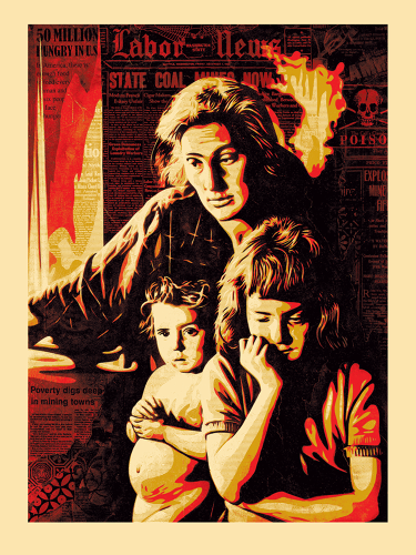
Shepard Fairey x Jim Marshall, Gun Culture, American Civics Series, 2016
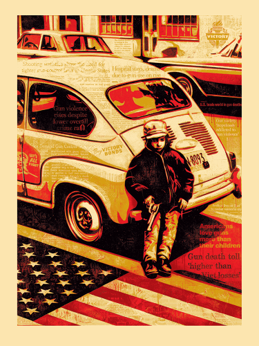
Shepard Fairey x Jim Marshall, Workers’ Rights, American Civics Series, 2016
Cesar-Chavez-American-Civics
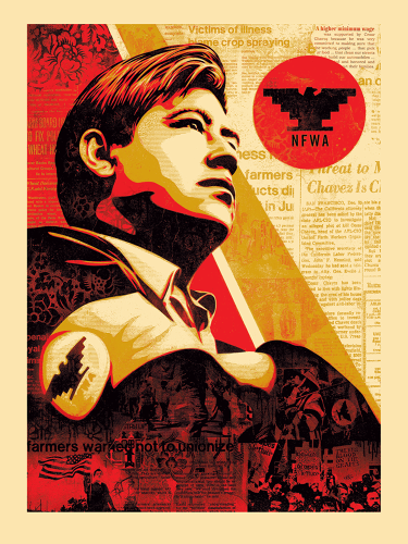
Fast Company , Read Full Story
(45)