Why Apple should have retired its (perfectly good) HomePod design
After discontinuing its inaugural HomePod in 2021, Apple has decided to give its smart speaker another go, announcing today that the HomePod 2.0 will go on sale February 3.
Based on what we know (from press release, specs, and images), some of the new HomePod’s improvements and new features make sense, while other aspects of the new product are head-scratchers.

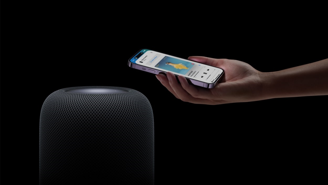
Like the previous version of the device and its HomePod Mini sibling, the new HomePod is a voice-activated music player—a vehicle for the Siri voice assistant (for sending/receiving texts, making lists, getting information, etc.)—and a hub for controlling all of Apple’s smart home devices.
What’s to like
Both new versions, the HomePod and HomePod Mini, add a couple of cool features that help Apple catch up to the competition (Amazon/Alexa, Google/Assistant) in the smart-home arena. Apple put temperature and humidity sensors inside, which can trigger the Apple Home platform to do things like close blinds or turn on fans or douse lights when a certain room temperature is reached.
Apple says the new HomePods can also passively listen for smoke alarms and carbon monoxide alarms. This catches Apple up with Amazon’s Echo devices, which, with the Alexa Guard feature, can listen for the sound of alarms, as well as the sound of breaking glass, and send the homeowner an alert if they’re away from home.

I like that Apple dropped the retail price for the new HomePod. It retails for $299, $50 less than its predecessor ($349), which was announced in 2017 but did not ship until February 2018. The new Mini goes for $99.
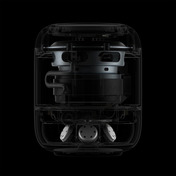
This new HomePod appears to have the same powerful woofer as the old. An image in the press release shows that the speaker sits at the top of the inner design, facing upward. Like the first HomePod, 2.0 has a series of tweeters pointing outward around the base of the design, but there are fewer—five compared to the first HomePod’s seven. And the new version’s tweeters are angled upward toward the user’s ear, far more so than those in the first version—an update that’s likely to improve the crispness of the sound for many users.

Additionally, the new HomePod has four microphones for listening to the room (and EQing music accordingly), whereas the original had six microphones. Those four microphones will also be used for spatial audio, which is meant to arrange specific instruments and voices in the room, rather than just along a left-right axis. When we get a review unit, we’ll find out how well that actually works.
What’s not to like
I can wrap my dislikes into one long bullet point.
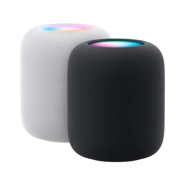
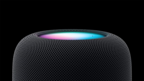
It’s too familiar. From the exterior, HomePod 2.0 looks exactly like the old one. Same shape. Same mesh fabric design (also available in white or black). Same top control surface design. You’re not getting any new Apple design. This might be fine if the first HomePod was a hit product, but it wasn’t. It was canceled, very likely because it just didn’t sell well.
If Apple wants to revive its smart speaker game, it should have given the new HomePod a new design, top to bottom. A new design would have suggested to consumers that the device had been rethought and reinvented and was worthy of a new analysis of the price and value proposition. The $50 price drop alone isn’t likely to convince consumers to give its smart speaker another shot.
(31)


