Why Biden’s new podium is the perfect metaphor for his presidency
By Pete Oyler
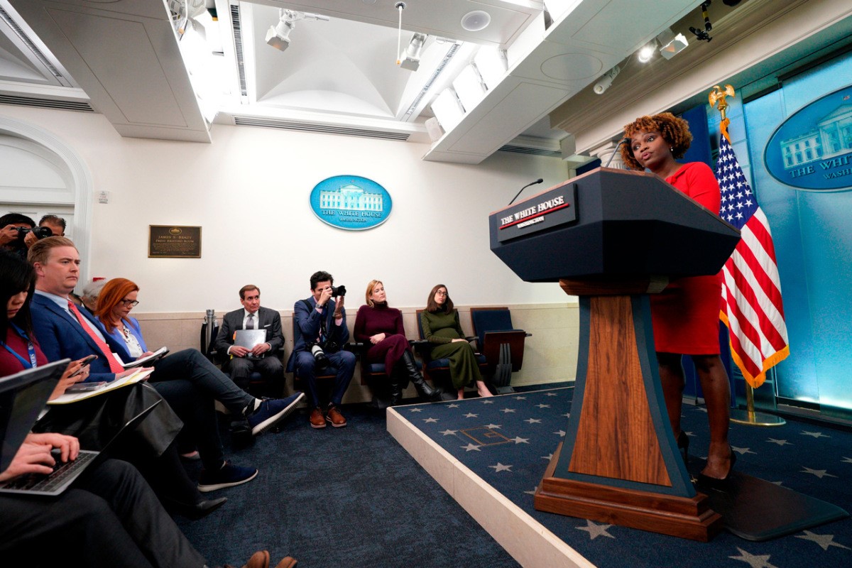
President Biden has just unveiled a powerful new weapon in the battle for hearts and minds: A lectern. The timing of this new piece of furniture—less than a year before the next presidential election—suggests much more than a simple shift in décor.
Used for centuries—and in its earliest iteration to raise priests like deities above the practitioners of the Catholic church—the lectern offers a clear utility: It holds notes, papers, and/or books for its reader, who is presumably standing and typically on stage. As a designed object, the lectern is powerful. It elevates and supports the world’s greatest orators. But furniture design is always in a reciprocal relationship with culture, technology, and politics. Ikea, for example, couldn’t exist in an agrarian society. Likewise, the design of Biden’s new lectern seems to embody the spirit and challenges the current administration faces in this new election year.

Placed in the West Wing’s James S. Brady Press Briefing Room, a space named in honor of James Brady, who was shot and survived an assassination attempt while serving under President Reagan, the lectern will at its most simple be the piece of furniture Biden stands behind during press conferences. The room itself was established in 1969 under President Nixon, replacing what was then a swimming pool (Nixon must have preferred the idea of drowning in press briefings) and from 2005 to 2007 it underwent renovation during the Bush Administration. In July of 2007, the room was reopened with a ribbon cutting ceremony, and covered widely in the media, reminding everyone that press briefings, and politics writ large, embraces theater. It is worth noting here that the briefing room includes a literal stage that separates and elevates the speaker from the press. It’s performative by design.

The new Biden lectern wasn’t purchased off-the-shelf, and technically there is more than one permutation (I’ve encountered pictures of two models that feature similar geometries at different proportions). It was designed and fabricated by “several members of the military and two civilians,” according to NBC Senior White House Correspondent Kelly O’Donnell. The base of the new Biden lectern is designed around a curved triangle. Known for its structural integrity, strength, and resilience, the triangle is reliable, sturdy, and predictable.
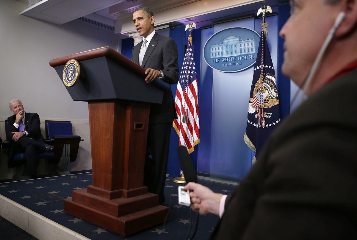
I believe the communication here is layered and not particularly nuanced: The Biden Administration is doing everything it can to downplay Biden’s age. At 81 years old and with 77% of American adults believing he is too old to be president, the strength of the triangle and the view of Biden the tapered form affords is no doubt meant to make Biden appear strong and enduring. Unlike Bush’s lectern, or another seen in images used by Obama and Trump, this design allows press to see the speaker’s legs, perhaps as a demonstration of Biden’s literal stability and symbolic transparency.
Painted blue steel provides an exterior structure in which black walnut veneered panels are inset. Steel is of course a strong, durable material, but in this application, it looks a lot like tape. Materials speak their own language and employing steel as the core structure might be read as a nod to the Rust Belt and to the legacy—and hopeful future—of American manufacturing, a central tenet of Biden’s domestic agenda.
Wood veneer is essentially very thin slices of wood that are typically glued onto plywood or composite panels to ensure flatness and to circumvent the fact that wood is a complex material to build with: It expands and contracts, it requires craft based knowledge and understanding. Veneer looks like and technically is “the real thing” but is, in essence, a front. The lectern’s base is bookended by molding—a clear nod to more traditional taste. The molding appears to be pine with an applied stain. This is an easy and economical way to make one wood species look—at least at quick glance—like another and, like the veneered panels, is an efficient (though not an heirloom) solution.

In spite of traditional metrics that affirm the health of the American economy (i.e., low unemployment, job growth), there is much gloomier zeitgeist—while the economy is doing well according to some economists, most Americans do not agree. The Biden administration has been emphatic in its messaging that America is strong, Americans are resilient, and Bidenomics works. If the form and structure of the triangle are intended to affirm this sentiment, and in so far as the molding that caps the triangle base signals tradition, then the muted blue polygon that sits atop the triangle base is geared toward a more youthful and environmentally concerned audience—Biden’s most troublesome demographic.
Muted paint has been on trend for a while now, notably in the realm of automaker Audi’s introduction of Nardo Gray in 2021, which set a cool precedent for sparkle-less paint that’s meant to seem more soothing and even more sustainable than shinier finishes. The polygon form is no doubt meant to feel fresh. It looks like it could be at home in the dashboard of Tesla’s Cybertruck, though it seems like an afterthought plopped onto the base. (It almost looks like a giant chess piece topped with an EV.) This visual disagreement mirrors an uncomfortable reality: Biden does not poll well with young voters.
The sudden introduction of the lectern also feels significant, even desperate, given the fact that the Biden administration’s record of holding news conferences is notably low. The New York Times reported in April that, “In the 100 years since Calvin Coolidge took office, only Richard Nixon and Ronald Reagan held as few news conferences each year as the current occupant of the Oval Office.” While most of us caught our first look at the Biden lectern this week, as the 2024 Presidential Election gains momentum, we’ll certainly be seeing much more of it soon.
The design of Biden’s lectern is successful, not in how it stands or holds papers, but in where it locates us within our current political theater. The lectern itself may be new, but its clunky combination of elements represents chasms of American political culture that have been long festering—and are now center stage.
Pete Oyler is a furniture and object designer whose work explores the intersections of design, craft, contemporary culture, and history. He’s also an associate professor of furniture design at RISD and both cofounded and served as creative director and coeditor of Outpost Journal.
(23)


