Why Can’t The U.S. Government’s Graphic Design Be This Beautiful?
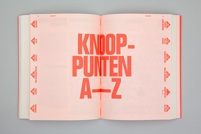
Maak Plaats, a Dutch manual on urban infrastructure, is so candy-lickable, it might as well be a graphic design creamsicle.
How do you make infrastructure policy seem revolutionary? You make the official guidelines look like the old flower-power posters, in the hopes of dredging up the same spirit of change that defined the 1960s.
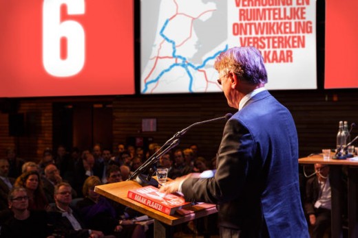
Designed by Alfons Hooikaas and Florian Mewes, two New York-based designers who have spent considerable time working in Amsterdam, Maak Plaats (translating roughly to both “Create space!” and “Get out of the way!”) aims to provide a series of guidelines to government workers on how to better use infrastructure and transit networks in increasingly urbanized North Holland. Sounds pretty dry, because it is, but thanks to Hooikaas and Mewes’ design chops, Maak Plaats looks less like a boring government manual than something Ken Kesey might have dreamed up after sharing a tab with an urban planner.

Maak Plaats is designed to channel a counterculture vibe, with 400 pages of collages, illustrations, bold typography, and fluorescent inks. “We wanted to create a sense of urgency by referencing the protest posters of the 1960s,” Mewes tells me by email.
Why that generation in particular? The thinking went that Europe’s flower children and political iconoclasts had grown up to become policymakers—in effect, to be the ones who make key decisions on public infrastructure. What better way to grab them by the throat than to use design that flashes them back to 40 years ago?

All told, the book took around 10 months to design. “Structuring a book for highly complex scientific content is a difficult task for any designer, let alone making it entertaining,” Mewes says. But the designers’ goal wasn’t just to make the manual look trippy. They also wanted it to be legitimately useful, and easier to navigate than most government manuals. For example, no matter where you are in Maak Plaats, arrows in the margins, almost like hyperlinks, direct readers to related sections and pages.
If you’re outside of the infrastructure world in the Netherlands, you’ll be hard-pressed to get your hands on a print copy of Maak Plaats. Just 1,000 copies were printed; it doesn’t even have an ISBN number. But luckily, the whole book is available to download as a PDF by clicking here. You can also find more information about the philosophy of public infrastructure the book is endorsing here.
Fast Company , Read Full Story
(103)


