Carmakers are signaling their move from combustion to electric vehicles with new logos that are lighter, rounder, and more lowercase.
The tantrums thrown across social media over the past few weeks in reaction to Jaguar’s redesign have once again revealed a fundamental contradiction underlying contemporary branding. According to its practitioners, it is supposed to differentiate and distinguish companies and their products, allowing them to stand out from the crowd, a line of thinking that was reinforced just last month when New York creative agency &Walsh rolled out its new mantra, “Find your weird.” But any attempt to do something even slightly weird with regard to advertising, marketing, or logo design is typically met by legions of armchair brand analysts taking to LinkedIn to declare it a failure. In Jaguar’s case, though, many took it a step further, viewing the rebrand as some sort of personal affront.
Certainly, the Jaguar campaign was meant to stand out in a provocative way. My personal favorite of the motley crew of characters in the now-infamous teaser video, the older chap dressed all in red, whirled about with a paintbrush in an effort to “delete ordinary.” And when the Type 00 concept cars were finally unveiled at Miami Art Week on Monday, in a perhaps James Turrell–inspired “London Blue” and “Miami Pink,” they were undeniably unusual; I don’t suspect anyone had “travertine plinth” or “mood-altering totems” on their New Jaguar Features bingo card.
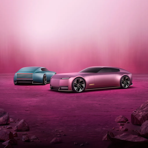
Yet, when the ire-triggering video and the automotive oddities are set aside, the remaining graphic aspects of the new Jaguar identity can actually be seen as rather conventional. They are fully in keeping with perhaps the most significant movement in logo design over recent years, the evolution of the symbols of automakers as they seek to signal their transition away from the internal combustion engine toward a fully electric future. Jaguar is just the latest in a long line of car companies that have adopted new logos that are generally lighter, thinner, rounder, less obtrusive, and more lowercase.
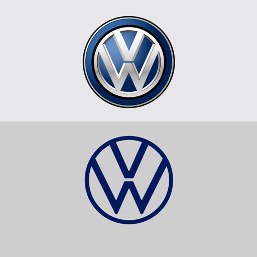
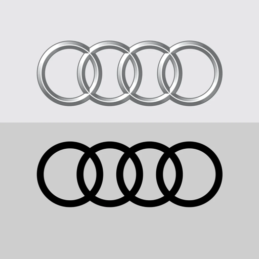
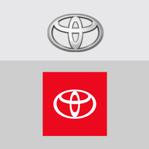
A dozen or so years ago, many carmakers’ logos were skeuomorphic versions of the physical badges affixed to their vehicles’ hoods: they gave an appearance of heaviness, shining with chrome features in three clunky dimensions. As general design trends moved away from 3D to flatness, many car logos followed suit. In 2017, Audi flattened and de-chromed its famous four rings, and Toyota did the same to its less-iconic ovals in 2019.
These sorts of redesigns soon became attached to larger changes in automakers’ business models. Later in 2019, Volkswagen tried to move past its emissions-testing scandal, introducing a “New Volkswagen” centered around electric vehicles, accompanied by a flatter, thinner, and lighter logo. In 2020, in concert with the introduction of an electric concept car, BMW not only flattened its logo, but made its outer ring transparent, in a move to “radiate more openness and clarity.” And in 2021, as it pivoted toward electric vehicles, General Motors updated its 57-year-old “Mark of Excellence,” rounding its corners, lightening its shade of blue, and downsizing its bold capital-letter initials to lowercase.
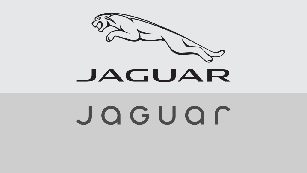
In this context, Jaguar’s new logos seem entirely on-trend. Its wordmark has gone from heavy all-caps to lighter “some-caps.” The capital “G” in the middle of the word that has vexed so many observers appears to be there simply because it is circular, adhering to the general roundness of the other letterforms.
The new monogram—which I am apparently alone in seeing as two flipped J’s, rather than as a J and an r—exhibits the same thinness as the wordmark. It would not look out of place on a designer handbag, as clearly Jaguar is striving to imbue its brand with additional luxury connotations as it seeks to sell its now even more exorbitantly-priced vehicles to rich young people (but will probably end up selling them to rich middle-aged people trying to pass themselves off as rich young people).
Most notably, Jaguar’s lithe “leaper” cat logo has been retained in a somewhat more abstract form, although you might not have guessed as much amidst all the outcry. As one of the few car brands that can sport such an evocative mark in a sea of uninspiring geometric logos, this was a wise move, even as it went against the campaign’s general approach of burning it all down and starting over. That the less-attractive circular “growler” mark has been phased out is no great loss, especially now that Jaguar’s engines will no longer growl, but simply emit a soft electric hum.
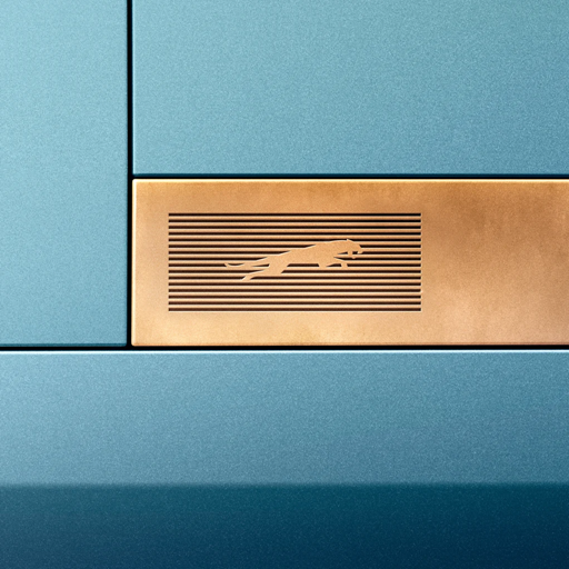
Jaguar’s new horizontal “strikethrough” lines seem like a callback to the stripes that Paul Rand famously passed through the IBM mark in 1967, leading to a deluge of striped logos denoting “high technology.” Even the “Type 00” name has precedent in electric-era car rebranding. Earlier this year, Honda introduced a new version of its logo, in which its H is unencumbered of its squarish holding shape, to be used with its forthcoming EV’s, including its, yes, “0 Series” (motto: “Thin, Light, and Wise”).
And while Jaguar has informed us that “00” is pronounced “zero-zero” and not “double-O,” one can’t help but think the name is a nod to Jaguar’s British heritage via James Bond, even though it’s well known that 007 drove an Aston Martin before a series of unfortunate product placement deals forced him first into some BMWs, then a Ford Mondeo.
“Unapologetic” is a popular word in marketing and in the culture at large these days. Refusal to apologize is seen by many as a strength, and those with the most to apologize for are the proudest about not apologizing for anything. The new electric-fueled logos of Jaguar and other carmakers, though, feel thoroughly apologetic. We’re sorry, says Volkswagen’s new logo, about rigging those emissions tests. We’re sorry, say the other new auto logos, about polluting the atmosphere and bringing about climate change. We’re going electric, they promise, and we’ll be cleaner, quieter, lighter, more transparent.
ABOUT THE AUTHOR
Fast Company
(17)