I generally consider myself immune to social media ads, by virtue of them feeling a bit too much like a rickety snake-oil cart pulling up into my feed. But for weeks now, one advertisement has risen above all the miracle tonics, suspicious snack foods, and fast fashion, leaving me desperately trying to keep my wallet in my pocket.
The Character Toolbox—a $165 storage unit that comes in a variety of delightful hues, and admittedly looks not entirely dissimilar from the toy toolboxes I played with as a kid.
Spend any time on social media, and you’re likely to also see other products that play in this proverbial sandbox. Items like Our Place’s Wonder Oven—a kitchen appliance available in a variety of delightful hues, which looks not entirely dissimilar from the Easy-Bake Oven my sister and I used to burn all manner of things in back in the ’80s.
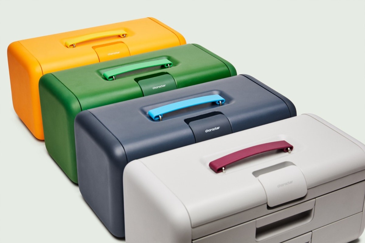
Collectively, the Character Toolbox and Wonder Oven represent a new trend—a class of products my editor and I have dubbed (at least on Slack, anyway) Juvenile Design.
And which leave us wondering: Why are we returning in droves to high-end facsimiles of the things we used to play with as children?
Building Character
If you’ve spent any time in a big-box hardware store like Lowe’s or Home Depot, it’s immediately evident that there is no one type of consumer who walks the aisles—it’s everyone from professional contractors to clueless new homeowners.
The problem, Character cofounder Alex Onsager says, is that the store’s offerings can’t cater to each member of that vast audience. This is especially true for younger homeowners. Onsager says that during interviews with Character’s community members, they learned that most kept their tools in the basement, in arbitrary containers or inflexible solutions like molded plastic cases. His first goal was to make a highly functional storage solution—in this case, crafted from durable stamped 22-gauge steel with a powder-coat finish—that users would actually leave out in their home, rather than hide it away in a cabinet (as I do my dependable yet hideous DeWalt tool bag).
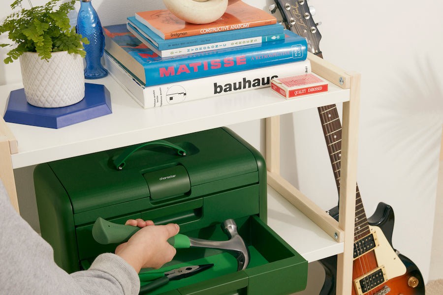
“Something that you’re willing to put out on your desk or on your shelf also means you’re just going to use your tools more often—which is exactly what Character is all about,” he says.
For design inspiration, Onsager says his team took cues from products like Away suitcases and Open Spaces storage racks, in addition to traditional toolboxes. Perhaps the reason Character’s toolbox so keenly reminds us of our childhood play versions—the classic form factor. Onsager adds that this nostalgia wasn’t a goal from the get-go, but if you were to draw a toolbox from memory, you’d likely wind up with one that looks like Character’s. Those heavy-gauge stalwarts that many of us still have from our grandparents have staying power in our collective memory for good reason—they were incredibly well-built and became the defining image of the object’s form and function.
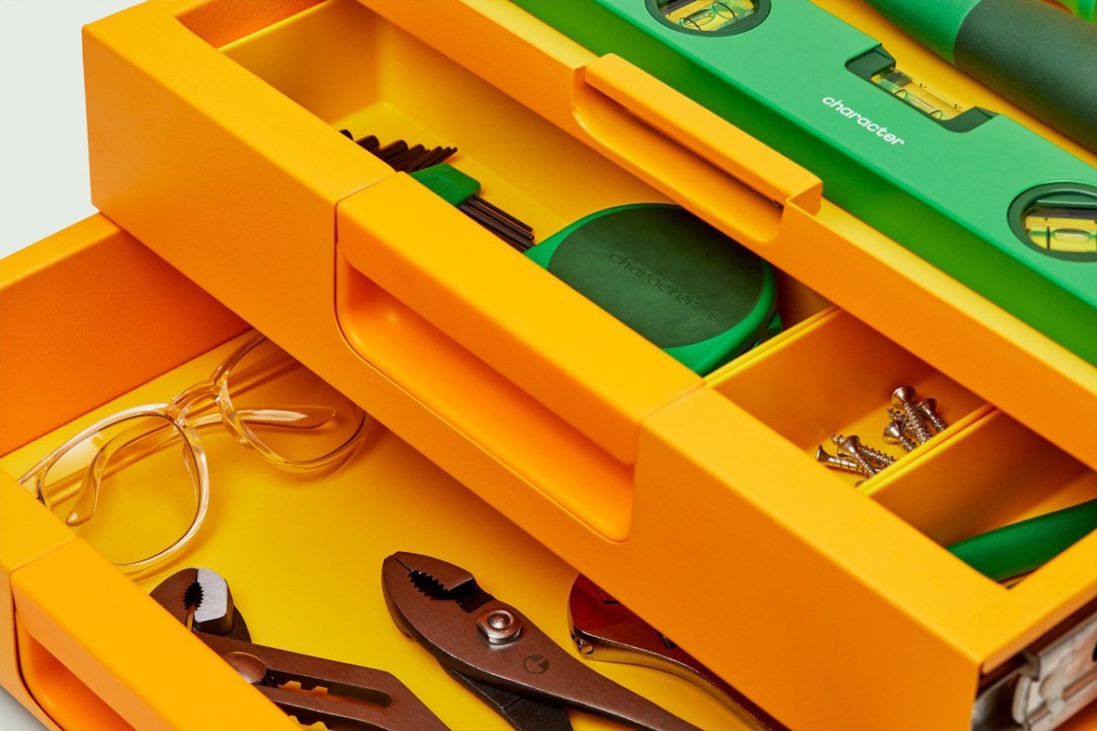
While Character launched as DTC in July, it debuted in The Container Store, and Onsager is hopeful that the brand could soon appear in big-box hardware stores. A $165 toolbox in a hue dubbed Sunshine might startle a suspicious contractor, but it just might make someone else’s day. And as for those colors: Onsager is happy to say that the neutrals have been the least popular so far.
Baking in nostalgia
If Character’s stated goal is to get people to use their tools more, over at Our Place, cofounder and co-CEO Shiza Shahid says her mission is to get people to cook more. The popular pan purveyor recently entered the kitchen appliance space with its Wonder Oven, a six-in-one toaster oven/air fryer. Shahid says that given the fact that so many consumers in Our Place’s community live in small apartments and lack disposable space, multi-functionality was key—and so was minimizing the overall dimensions of the appliance. The oven is designed to look so good and take up such little space that consumers will want to leave it out on their counter (which, let’s be honest, doesn’t hurt from a marketing/word-of-mouth standpoint, either).
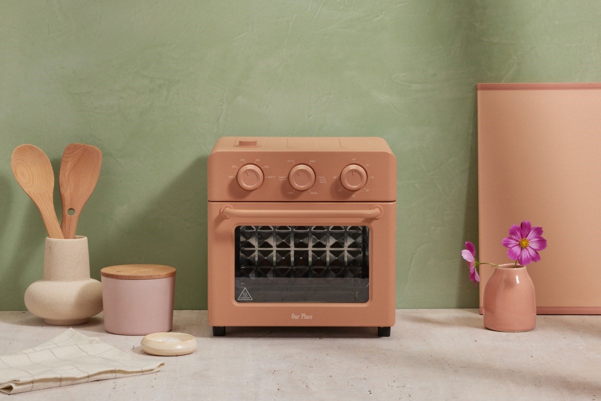
Contrasting all the endless brushed stainless steel junking up our kitchens, Our Place infused a medley of colors into the range, and like Character, found success in doing so, with the Spice (pink) color selling out in a mere two days.
The oven’s design was driven by pure functionality—how could you make a useful appliance without the confusing interface? “A lot of folks have been trying to compete with each other by just adding buttons, and the buttons kind of do the same thing,” Shahid says. “It’s heat, it’s time, it’s the circulation of air. And so why not bring it back to the basics and make it a lot more simple for folks?”
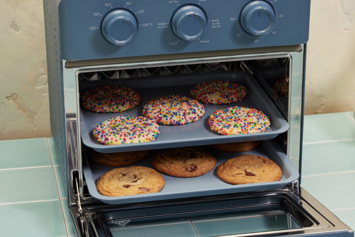
In doing so, she began hearing the word “Easy-Bake Oven” from her team, which at first meant nothing to her. After all, she notes, she’s an immigrant from Pakistan. Her colleagues had to get her up to speed on that very particular slice of Americana, but she admits that some of that nostalgia was no doubt top of mind for her team as they worked on whittling the device down to its most necessary and elemental.
Like Our Place’s other products, the oven has gone viral on TikTok, where, yes, the Easy-Bake Oven comparisons have also been made. And it has, unsurprisingly, totally sold out through October.
Out with the sterile
So why are these brands resonating so deeply with consumers, and why now? Nichole Rouillac, founder and creative director of design studo Level, says that first off, juvenile design comes down to a rejection of our current status quo of sterile, cold, personality-free objects. And that extends beyond industrial design to lifeless graphic design and myriad forms beyond. People are just bored with boring. And she says that’s especially the case in often overlooked categories like, say, small kitchen appliances and home-improvement storage solutions.
“I just want my kitchen to look beautiful, and it’s really hard,” she adds. “I sourced from Japan and other countries just to actually try to get things that are aesthetically pleasing for my home and also for the office.”
Rouillac has also been dipping into the neuroscience of nostalgia lately—which she says shows that nostalgia helps abate depression and anxiety. And for so many, that’s critical right now, and what could be at the heart of this movement.
“During COVID and all that, we were experiencing during those times—the economic unrest, and everything that’s happening to our planet, global warming—people are looking for a time when life was more simple, [to] products that just kind of bring back joy and happiness. . . . After what we’ve gone through these last few years, I think it’s what people are craving and really need.”
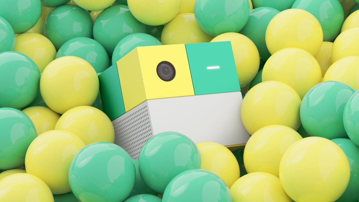
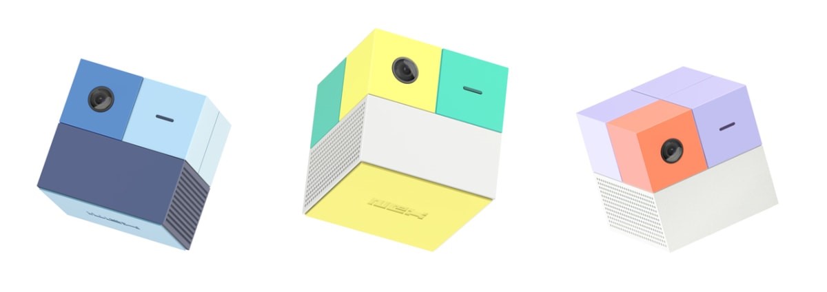
Adults who came of age in the ’80s and ’90s are now in nesting mode and having children, and it’s likely no coincidence that that’s the decade where these aesthetics feel anchored. Whether parents are looking to infuse their lives with the objects that brought them joy when they were younger, and bring them comfort today, or are trying to pass that joy on to their own children, they now have the purchasing power to do so. (To that end, Rouillac’s newest project that’s in the works, Nex Playground, seeks to capture that joy in a bottle, er, box, for parents and kids alike.)
Toward the end of our conversation, Rouillac brings up one more outstanding purveyor of juvenile design: Teenage Engineering, whose synthesizers, mini record factory, and even Ikea collabs perpetually delight. “Every time I see something new that they launch, it’s just like, I don’t even need that. But . . . ,” she says.
And damn if she’s not right. I’ve been fetishizing Teenage Engineering’s TP-7 field recorder for months now. Say what you will about capitalism. But I have a hunch that the TP-7 and a colorful toolbox might just be the best investments I’ll make for my mental health all year.
The only question remaining: Does this mean I can now use my HSA card to buy both?
(51)