Why Won’t Apple Fix The iPhone’s One Huge Design Flaw?
Next week, Apple will unveil the iPhone 7. And of all the new hardware upgrades it will likely receive, rumor has it that the design fix the iPhone has needed the most for nearly a decade won’t be referenced on stage at all.
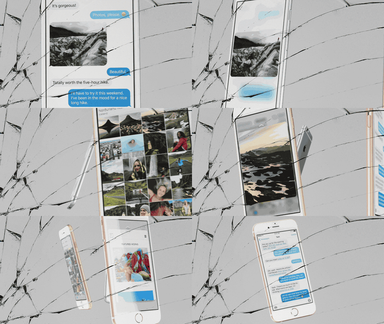
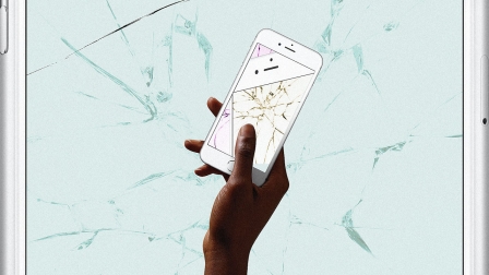
The iPhone will still have a glass screen that will shatter if you drop it wrong. And sooner or later, millions of us will drop it wrong.
Since the first iPhone was released nine years ago, Apple’s smartphone has received myriad upgrades: 3G data chips, then 4G data chips, a Retina display, an HD camera, a backlit HD camera, a Touch ID fingerprint sensor, and a 3D touch sensor that measures how hard you push. A magnetometer measures the Earth’s magnetic field to point you in the right direction, and a gyroscopic sensor can measure the device’s pitch, roll, and yaw.
It got 24% thinner, then 18% thinner, then 9% thinner. It got two times faster, then two times faster, then two times faster, then two times faster, then 70% faster. It was gilded. Then rose gilded. It got an official battery pack and a tiny lightning connector. And the overall industrial design itself has been tweaked half a dozen times—which along the way created new problems including Antennagate. Then Bendgate. Then Touch Disease.

But none of these problems is as devastating as the one problem we already knew about: the screen, that delicate, delicate screen. The Hummel figurine we hold to our face. The antique tea set we text on. The very literal thin piece of glass that we squeeze into the nearest pants pocket a hundred times a day. Apple has prioritized the iPhone’s aesthetics over UX, and tens of millions of iPhone users suffer as a result.
Apple sure knows how to sell a product. But does it get how to build one?
I know, I know. It’s Gorilla Glass, with a tensile strength that bests aluminum. But it still shatters, and by now, almost every iPhone owner has at least one shatter story to share. Many have several. You dropped your phone—from just a few feet in the air—and it cracked in a spider web of shards. So you squint past the pieces as you attempt to send emails and read Twitter, mulling whether to wait for the next iPhone or to suck it up and take that inevitable trip to the Genius Bar to pay $130 to fix an $800 phone with a two-year shelf life.
Apple’s glass iPhone is impossibly beautiful because it connotes fragility—the preciousness of something you have to handle with silver polishing gloves. The problem is that it’s actually fragile. According to SquareTrade, 25% of iPhone users have broken their screen at some point, and 15% of iPhone owners are using a phone with a broken screen daily. Can you blame them for delaying the repair? Americans spent $23.5 billion replacing broken smartphones in 2014—an untold chunk of which goes to iPhone screen repairs, which cost Apple about $40 in parts but cost you roughly $110 to $130 (or $80 to $100 if you have AppleCare).
Putting aside the fact that Apple is likely making a lot of money off iPhone screen repairs (and even more from warranties, which represent revenues in the $1 billion to $2 billion range), why hasn’t it prioritized durability in its industrial design, as some of its competitors have? Because if Apple focused on building a more rugged product, it could likely make an unbreakable—or at least far less breakable—iPhone screen.

In late 2014, the iPhone 6 was heavily rumored to get a sapphire display—the more scratch- and shatter-resistant clear material used in iPhone’s camera lens and the Apple Watch. Ultimately, the factory supplying the sapphire couldn’t produce to Apple’s specifications and went bankrupt as a result. Furthermore, sapphire would add a lot to the iPhone’s build price, as much as 10 times the cost of glass, while requiring thicker material. A viable alternative is in development at Corning, makers of the Gorilla Glass used in iPhones today, which has a process that coats glass with an ultra thin layer of sapphire.
But sapphire isn’t the only way to build a tougher screen. Motorola has done so successfully with its Moto ShatterShield displays. Motorola’s secret is to build several layers of screen to absorb shock. The catch? While reviewers insist you wouldn’t know it, Motorola’s display is technically built from plastic—a less premium material than glass. Meanwhile, Samsung’s latest “shatterproof” display on its S7 smartphones—which is new enough that it may or may not live up to its name—is glass, but that glass is covered in a thin layer of plastic, like a screen protector.
Adding more layers seems to protect screens. Yet in this regard, Apple has actually gone the opposite direction of Motorola and Samsung. Since the iPhone 4, it has removed layers, not added them, fusing the glass you touch to the screen itself. This allows the phone to be thinner and the screen brighter; it feels more like you’re literally touching the content on the screen. But it also makes the part more expensive to replace, because you’re not just replacing glass, you’re replacing glass that’s been fused to a premium LCD display. As third-party repair company iFixit explained to me, separating and re-fusing these two pieces is so hard they don’t even bother to sell customers either component alone.

Why would Apple make these decisions—selling us a screen that’s the most common break point on the phone, and also building it in a way that’s painstaking to fix? Removing repair and replacement profitability from the equation, the most convincing answer is aesthetics. Apple has an obsessive relationship with industrial design, but more than that, a fetish for thinness. The iPhone 6 is roughly half as thick as the original iPhone. Most of us would agree, it feels thin enough! Any thinner, and we’re entering SNL sketch territory, with a phone that’s difficult to grip (and even more droppable). Over almost a decade, Apple bought itself some precious sub-millimeters before any of us feel like Zack Morris circa 2007. Meanwhile, the iPhone 7 is rumored to be 17% thinner than its predecessor—following the hilarious conspiracy theory that the iPhone will by 0 mm thick by 2023.
As one famed industrial designer explained to me, to make the next iPhone shatterproof—to adopt one of those Motorola screens—it might make the device thicker. The glass (or in this case, plastic) itself might be fatter, or the display might necessitate an extra enclosure securing it. In Apple’s iPhone 6 designs, the glass has become a near-artistic statement, with an almost handblown feel, curving around the surface of the device. Even if Apple could make a shatterproof display out of glass or plastic, it might not be able to shape it with such sculptural finesse.
However, Apple actually has made the phone thicker before—twice. The first time was for the iPhone 3G, which packed in lots of extra hardware and features. The second time was the iPhone 6s—which introduced 3D Touch, but may have also been reinforcing the frame against another Bendgate, too. The problem may be that we, as consumers, haven’t complained loudly enough about their shattering iPhone screens. And in the meantime, Apple has prioritized design decisions that make an iPhone tactically irresistible compared to anything that runs Android, rather than structurally sound when your toddler drops it from waist-height.
Apple’s fetish for fragility isn’t just a laughable oversight on an otherwise well-designed product. It actually makes the iPhone a failure when it’s pulled from an Apple Store to face the rigors of real-world UX. In its quest for beauty, Apple is championing marketing while ignoring the long-term experience customers have with the iPhone. Apple is being willfully ignorant that 25% of its iPhones break in exactly the same way—so tens of millions of their customers are forced to squint through broken screens or take an unadvertised trip to a back-alley repair shop. It costs people money. It costs people time. And it costs Apple . . . oh, right, it costs Apple nothing.
Given that Motorola has made what’s likely the most durable phone in history, and no one outside a few tech bloggers seem to care, Apple’s impossibly polished figurine phones might have been the better business decision. But putting so much effort into trivialities like vibrating home buttons, when the iPhone requires the equivalent of bubble wrap to stay safe? That’s just a shitty way to build products for people. Maybe Apple should make sure the iPhone’s old features are sorted out before it tries to sell us on new ones.
[All Photos: via Apple]
Fast Company , Read Full Story
(28)


