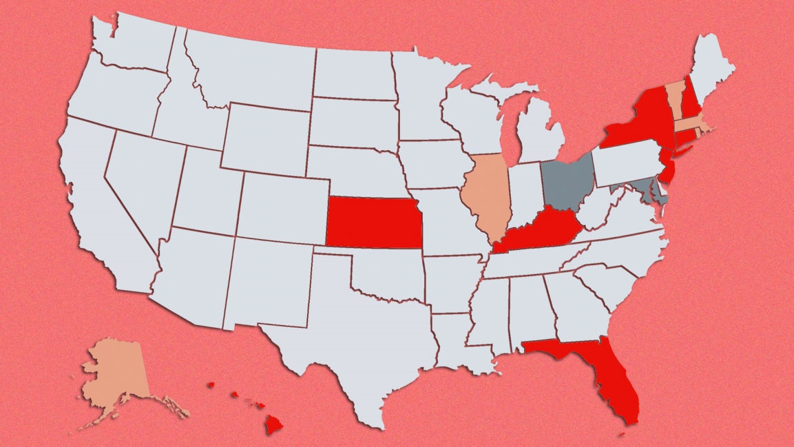
Will we shut down again? Can I travel to Florida? These COVID maps will help guide you
Shutdowns, you might have heard, are all the rage again.
After states made various attempts to restart their economies a few months ago—often to the chagrin of public health officials—many cities and towns across the United States are struggling more than ever to contain coronavirus outbreaks. Nationally, daily new infections have averaged above 50,000 for more than a month, and calls for a coherent national strategy are growing louder. In an op-ed (August 19, 2020), doctors writing for Harvard Business Review said “a new round of lockdowns should be implemented to prevent the current worrisome situation from becoming much worse.”
For now, at least, it’s up to the states to decide which methods they’ll employ to stop the spread of COVID-19, and while the lack of a national plan has resulted in a hodgepodge of state-level regulations and restrictions, there are a number of resources out there to help you keep track of it all.
Online maps are especially useful, and combined with up-to-date data and easy-to-use interfaces, they can be a good starting point for figuring out exactly what’s happening in your state, or a state you plan to travel to. I’ve rounded up some of the best maps I could find below:
(19)


