With Its Updated iOS App, Evernote Is Going Back To Note-Taking’s Basics
People may use Evernote in all sorts of ways, but at its heart, the app is about one thing: notes. It’s acknowledging that today with a new version of its iOS app—a complete redesign created with the aim of making it not only easier to write notes on the fly, but to find notes you’ve already created.
“Some of the feedback we’ve received from users has been that they love all the capabilities and the power of the product, but at the same time they’re trying to get in and out of the application very fast,” says Erik Wrobel, Evernote’s chief product officer. He admits that the app has made basic tasks such as adding a quick note more time-consuming and clunky than necessary. With this new release, dubbed version 8.0, the team thought a lot about how to remove that friction from the system, make the process quicker, and help you feel more organized.
To do that, Evernote rebuilt the app from the ground up, giving it a new streamlined interface, and putting the app’s key features at the forefront so they’re easier to find.
Notes When You Need Them
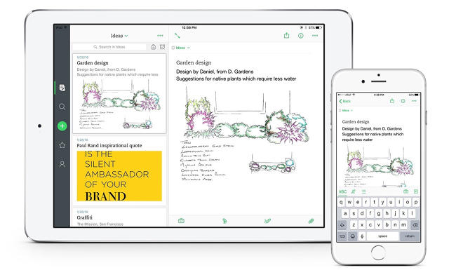
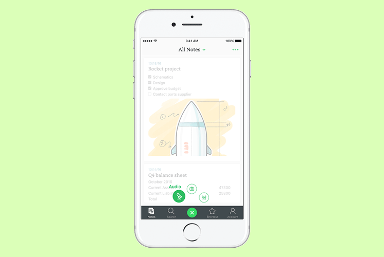
Now when you launch Evernote, all your notes are front and center, listed chronologically based on when you last worked with them. So, if you were looking at a work spreadsheet on your laptop, that spreadsheet will be the first thing you see in your timeline when you pick up your iPhone. That grocery list you added to this morning at breakfast will be close behind.
The main interface screen defaults to a view of all your notes, regardless of the notebook they’re assigned to. You can also switch your view to a particular notebook using a nifty drop-down menu at the top of the page. But the idea is that what you’re looking for is more likely to be right there when you launch the app, so you don’t have to spend a ton of time poking around for it.
The app is also just faster in general. “We rebuilt the code base with the intention of making the app faster, and while we don’t have exact performance numbers, we believe most users will find the new app feels much faster,” says Wrobel. “If you were to use the [previous] version and the 8.0 version side-by-side, you would notice a significant difference in speed. Evernote 8.0 is a great mix of improved speed within the app, paired with a fresh design that gets you to where you want to be faster and without friction, essentially working at the speed of thought.”
The Same Evernote, Only Less Of It
A big part of that speed improvement comes in how you create notes in the app. When you launch the new Evernote app, one of the first things you’ll notice is that there looks like there’s a lot less to it. All the same functionality is still there, but Evernote has done a much better job of streamlining the experience so that it’s more intuitive and easy to use.
“The overall design of the app has been reimagined to be much more focused,” says Nate Fortin, Evernote’s VP of design. “It’s not an accident how we got here. We started out with some basic concepts and a lot of conversations with our users.”
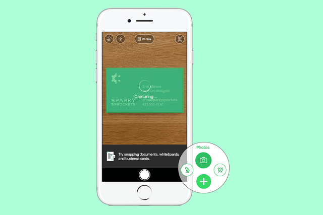
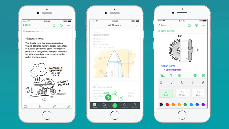
Along with the timeline of your recent Notes on the first page of the app, you’ll see a small toolbar at the bottom of the page with a plus sign at its center. Tap that, and you can instantly create a new note. If you long-press the same button and slide it up, you get a few additional options: the ability to record audio, capture images, or set up notifications.

Brightening Things Up
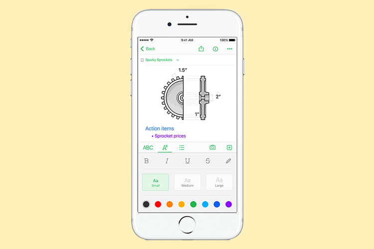
The app also adds new ways to style your notes. Rather than just letting you type notes in black text, the new text editor offers the ability to choose different colors and sizes, useful for creating headers and subheadings within a note or highlighting a particular word or phrase.
“We’ve paid a lot of attention to the presentation of the note and presenting it in a richer and more expressive manner,” says Fortin.
That philosophy extended to the timeline view on the app’s home screen as well. As you scroll through the list, you can get a sense of what’s inside a note just by glancing at the small preview of it on the screen. The idea is that you can personalize your notes, just as if you were scribbling them in a real spiral notebook with highlighters and colored pens at your disposal.
Evernote has an exceptionally passionate user base—a fact that got reinforced when many of the company’s customers pushed back on planned revisions to its privacy policy in December, leading the company to abandon them. Those who use both a personal account and Evernote Business get another welcome new feature: a quick way to switch between accounts by long-pressing on the Account button on the app’s new toolbar. That means you can keep your work and personal life separate, and hop between them in less than a second.
Evernote’s new iOS app is available now for the iPhone, iPad, and iPod Touch.
Fast Company , Read Full Story
(44)


