With new One UI, Samsung shows some empathy for smartphone users
The research says we’re spending more than 3.5 hours a day looking at our smartphones. So the presentation of stuff on that little square of glass matters. Samsung has been a little slow getting hip to that. Its user interfaces over the years have betrayed a focus on what Samsung wants to present there, rather than what the user wants and/or needs to see.
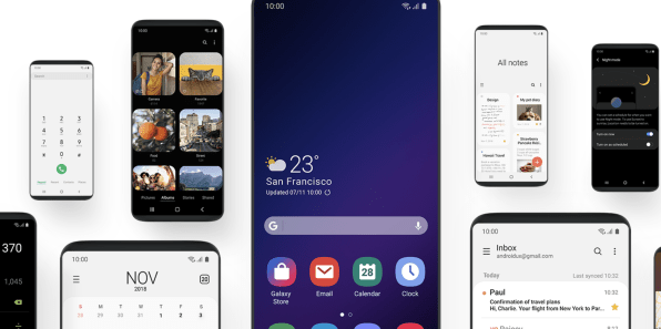
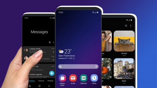
That’s been changing, however, and Samsung made perhaps its biggest leap yet into human-centric design today with the announcement of a new UX called One UI. Where Samsung once famously cluttered the UX with clunky icons, too much data, and too many apps, One UI espouses simplicity and user focus, natural interaction, and visually pleasing environments.
“We aim to create a UX based on how people use smart devices today,” said Samsung UX designer Jeewon Lee, who leads the team that developed One UI.
She explained that Samsung’s UX, first of all, must be very aware of the hardware around it. The corners of the UX, as well as the corners of the app icons, more closely mimic the curved corners of premium Samsung phones like the Galaxy S9.

The app icons have themselves been completely redesigned to more immediately and obviously suggest the apps behind them.
Samsung phones run a customized version of Google’s Android OS, but over the years, Lee says, the UX has had a tendency to become more complicated as new features were added. And Samsung designers have had a habit of putting every conceivable option right up in the user’s face, even ones that would rarely be used.
“With these new design approaches we want your eyes to be drawn to what matters, rather than be distracted by what you don’t need,” Lee said.
One UI, for example takes all the menu items in Settings and arranges them in groups. It also puts the ones that are used most up at the top of the list.
In another example, the little bits of data on the very top of the display are reduced in One UI so that only the ones the user’s needs are visible. In the phone interface, the search bar and user tabs disappear because the user isn’t likely to need those during a phone call.
One UI pays a lot attention to ergonomics and natural interaction. “As phones have gotten bigger you are expected to have the dexterity of a classical pianist to reach all the functions,” Lee said.
So the new design aims to put buttons and other interaction modes in the middle or bottom half of the display where the user can easily reach them without having to stretch their thumb way up to the top of the screen while in one-hand mode. The tabs in the Clock app are moved to the bottom of the screen, as are the sharing buttons in the Photos app.
The future is foldable
One UI is also designed to work with the next generations of Samsung phones that will have foldable screens. The company announced earlier today that it will begin manufacturing foldable displays in the next few months—showed a prototype foldable display at an event—but a foldable Samsung smartphone isn’t likely to hit the market until well into next year. Importantly, Google said today that its Android operating system will begin supporting foldable display functionality.
“The OneUI serves two purposes–one for the current devices to make them easier to navigate, and the second if for an easier transition to the flexible display that will come,” says Creative Strategies analyst Carolina Milanesi. “Many of the changes that we saw are in line with what we have seen from Google and iOS so it should simplify things for users and app developers alike.”
And let’s not forget that Samsung is in competition with Google and its own Nexus phones, which run a clean and elegant version of Android.
Samsung says it will start beta tests of the new One UI this month, and that it will release the UX in January 2019. One UI will work on the Galaxy S9, Galaxy S9+, and Galaxy Note 9.
(20)


