With Samsung’s Galaxy Z Fold2, phone experiences are morphing—again
Samsung head of mobile user experience Yoojin Hong says that the new Galaxy Z Fold2 foldable, which went on sale Friday, embodies Samsung’s pursuit of richer and more personal interactions with technology–something she says the pandemic has made even more of a priority. I talked to her about how Samsung’s view of mobile user experiences has changed over the years, and about the considerations that were top of mind when the user experience team at Samsung started to think about foldable designs.
Hong is a 25-year veteran of the user experience industry. Prior to joining Samsung, she gained experience in consumer devices and mobile platforms at BlackBerry, Adobe, and Sun. In her career, she has seen smartphones grow to become the most popular and essential consumer electronics product around the world. Precisely because smartphones are so widespread, she says, thinking about user experience has to be done in such a way that it accommodates a vast range of abilities.
“There are certain key functions in a device that every single person uses, like making phone calls and messaging,” Hong says. “These should be as easy as possible because even your grandma is going to use these features. And then you go a level deeper and you have other functions that only about 20% of the users will care about, and our goal is to make those discoverable and accessible.”

[Photo: Samsung]
Hong tells me that as the smartphone market became more established, the two main operating systems, Android and iOS, started to resemble each other more and more. She says that while industry watchers might be interested in talking about who is copying whom, the reality is much more boring. The similarities are increasing because users on both sides share common likes and dislikes, and perform many of the same mobile tasks. So evolving the mobile experience is mainly about simply meeting users where they are.
With foldable-screen phones, it’s harder to know what users want because it is a very new category, Hong says. Vendors are taking different approaches. Some are focusing on productivity and mobility while others are focusing on design and mobility.
From the first generation of the Galaxy Z Fold to the second, Samsung’s focus shifted slightly because of the change to the external screen. The first Fold’s 4.6-inch cover screen was so small that the company felt the main, unfolded screen should default to a smartphone-style interface, even if the larger 7.3-inch display was closer to the size of a tablet. Samsung decided this because it wanted to lower the learning curve and ensure that the Fold met people’s expectations as a phone.
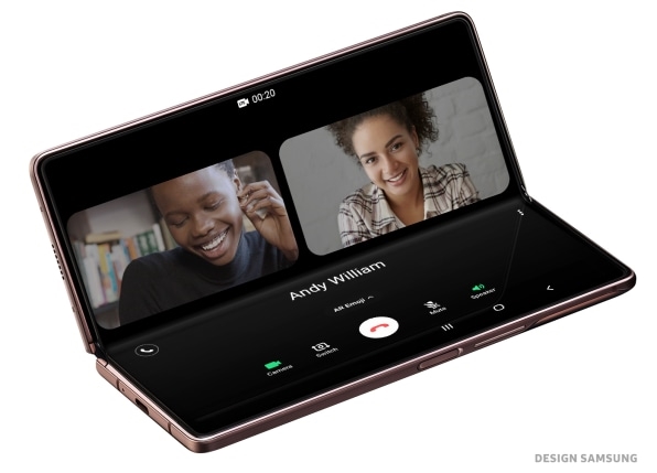
With the Fold2, the combination of a larger 6.2-inch cover screen and a 7.6-inch main screen meant that users could use the outside screen as a traditional phone while using the larger display to experiment more with how they wanted apps to work side by side.
We got 90% right, but the remaining 10% is what determines perfection.”
“Users want to be in control, and that consistency of experience across apps helps to drive that feeling of being in control of the tool they are using,” Hong says, adding: “This is why Samsung has been working with Google to prep the underlying Android operating system, but also with Microsoft and other partners to make sure the apps take advantage of the screen.”
When working on the user experience, Hong says that she does not focus on gender or age, but usage patterns. COVID-19 has impacted that, making us wear different hats throughout our day. She says our behavior is much more fluid now than before the pandemic, when our roles–and our device usage–were often defined by our location. In normal times, we use a more comprehensive range of devices, from the PC in our office to the console of our car to equipment at the gym. As we spend most of our day at home, our device focus narrows down to devices such as the Galaxy Z Fold2, Hong says.
One early finding from the first-generation Fold is that the form factor helps people use their gadgets less. They may go to the larger main screen when they are really serious about working or engaging with the device for a longer period of time. The cover screen plays a similar role to a smartwatch by allowing users to quickly glance at their notifications and take quick actions, then get back to doing whatever they were doing. At the same time, because people are spending more time at home during the pandemic, they can dedicate time to experimenting with the Galaxy Z Fold2 to discover how to best use the device to get the most out of it.
Picking up on Hong’s point on how COVID-19 has been impacting our behavior, I asked if she believes that some of these changes will stay with us long enough for her to start considering variations to her user experience philosophy. She points to two aspects that will impact our interactions with smartphones in the long term. First is the interaction between the phone and other devices in the home, such as speakers, TVs, and connected appliances. She strongly believes that Samsung has an advantage here because of its portfolio of products that span the home environment. Second, Hong believes that our need to experience more personal interactions through technology will only grow as some of our personal and professional interactions will likely migrate to digital form for good.
When I ask Hong if she feels satisfied with the user interface and user experience of the Galaxy Fold2, I can see her smile even behind her mask. “The devil is in the details!” she says. “We got 90% right, but the remaining 10% is what determines perfection, and I feel I am never done.”
Carolina Milanesi is principal analyst at Creative Strategies and founder of the Heart of Tech, a tech consultancy focused on education and diversity. She has been covering consumer tech for over 15 years.
(19)


