YouTube Announces Interface Makeover
YouTube Announces Interface Makeover

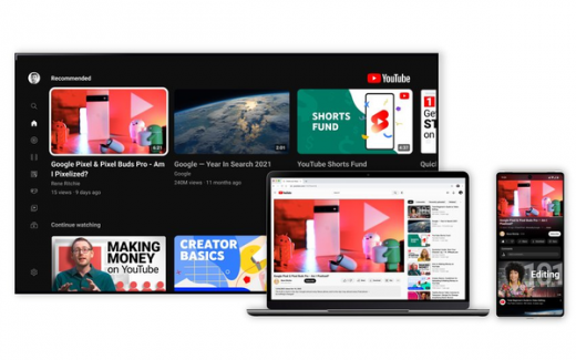
YouTube announced that it has begun to roll out a new look and additional features to all users beginning on Monday, including a pinch-to-zoom feature, new button options, ambient mode, an “even darker” dark mode, and more precise seeking.
The company’s new pinch-to-zoom feature, which became available as a test to Premium subscribers in August, allows iOS and Android users to zoom in on videos for heightened clarity on specific details.
“Ambient mode” is a new color effect based on the light screens cast out in a darkened room. It uses what YouTube’s UX Director Nate Koechley calls “dynamic color sampling” to alter the app’s background so it matches the colors making up whatever video the user is currently watching, Koechley added.
This feature will be available on desktop and mobile via YouTube’s dark theme.
Precise seeking is perhaps the most useful addition to YouTube’s interface update, as it allows users to easily locate the exact part in a video they want to rewatch. They can do this by dragging the cursor or swiping up (on mobile) on the video to unveil a row of thumbnails.
Users will also see the introduction of new buttons under videos, including links in video descriptions, which have been transformed into buttons to “minimize distractions.” The like, share and download buttons will appear smaller than before, and the subscribe button has a new, less intense look.
(24)


