YouTube’s new tool to track time spent watching YouTube is pointless
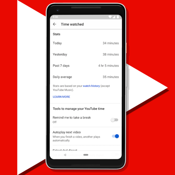
YouTube has debuted a new “digital wellbeing” tool that was designed to help you track how much time you spend watching videos on the platform. Called Time Watched, it charts how many hours you were zoned out, watching YouTube, in the last day, the day before, and the last week.
The release is part of a broader trend: tech companies are finally reckoning with how the addictive design of their products and services isn’t actually good for users. Apple has announced it will release a set of features in iOS 12 that gives users the ability to track how much time they’re spending on various apps (though even the company’s original interface designer thinks these don’t go far enough). Google is integrating features into its Android operating system that turn off notifications when your phone is face down and flip on gray-scale when it’s nearly time to go to bed–part of the company’s larger “digital wellbeing” initiative, which CEO Sundar Pichai announced during Google I/O this year. YouTube is just the latest platform to jump onboard. But its new features will likely do little to actually help people manage the time they spent watching videos.

The video platform’s digital wellbeing tools are hidden in the settings page of its app, aren’t accessible in the desktop browser, and are mostly opt-in–requiring users to do the work of finding and implementing them. The time-tracker feature is on by default–you can turn it off by clearing your watching history or watching in incognito mode–but because it lives in the settings as well, there’s a good chance most users will never see it. Most people don’t read terms of service, let alone adjust the settings for each digital service they use. Even if YouTube claims to be helping us manage the amount of time we spend on its platform, the implementation of that promise says something else: that YouTube is trying to superficially address the outcry against the distracting, addictive quality of digital devices, while continuing to cash in on user engagement. After all, YouTube’s revenue is directly correlated to how many people are watching videos–and being served ads.

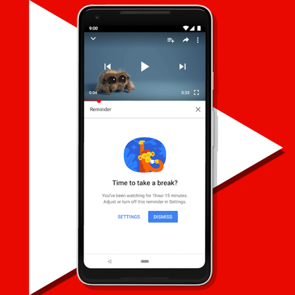
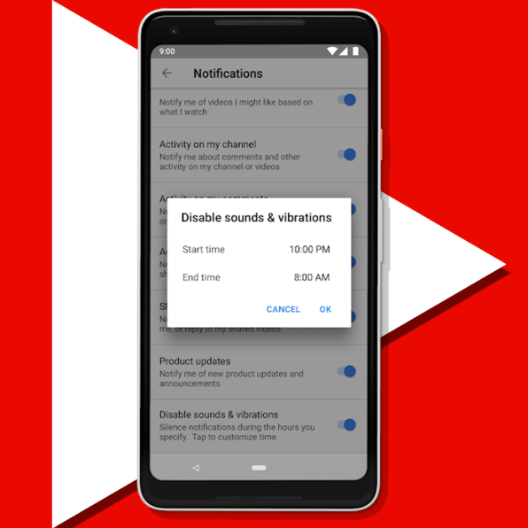
The new time-tracking dashboard isn’t the only surface-level fix YouTube has implemented. It also complements an already-released feature called “Take a Break,” which allows you to automatically pause your video after a pre-determined length of time, and two additional features that give you more granular control over your notifications. Besides being buried in the settings of the YouTube app, which makes them difficult to access in the first place, each tool is located in different places within the settings. It would make more sense to create a single section within settings that explicitly indicates “this is where to go to get help managing your YouTube habit.” According to YouTube, the Time Watched profile will be that location once it has been completely rolled out. It will also include a control to turn off the dreaded autoplay.

The rest of the new tools YouTube has announced are opt-in. Yes, now you can schedule notifications to remind you to take a break, but the impetus is on the user to find and implement the feature. Yes, now you can get all your notifications from YouTube at once, but you have to find this option in settings before that will happen. Yes, you can disable sounds and vibrations from YouTube notifications during the night, but again, the option is difficult to find. And the people who need these tools the most are likely the least inclined to actively look for them. Why aren’t these controls–all of which would ostensibly help cut down on the time people spend watching videos–the default? If YouTube were serious about helping people stop watching so much, its “digital wellbeing” tools would be more prominently integrated into the platform’s interface. YouTube tells Fast Company that these tools are off by default or customizable to give users more control of the experience overall.
What would a dedicated effort to curbing digital distraction look like? Perhaps if the new time-tracking feature were to automatically let you know every time an hour passed and you were still glued to your screen, devouring the next auto-playing video. Or better yet, if the company stopped auto-playing videos altogether. Making effective time-tracking features the default while letting people opt-in to the more addictive components of its platform, like auto-play, would suggest a true dedication to helping users make better decisions about how they spend their time on YouTube. But ultimately, YouTube doesn’t want people to stop watching. Its business model is based on convincing as many people as possible to watch as many videos as possible. Hiding a few pieces of UX in its settings won’t change that.
(26)


